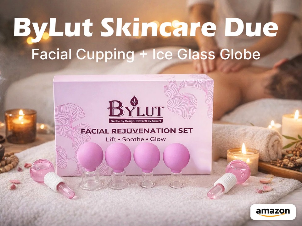
A full visual system for BYLUT’s Amazon listing: the main image set, A+ Content, and Brand Story for a purple facial cupping and ice-globe kit. The same visuals were then A/B tested on the listing.
Overview
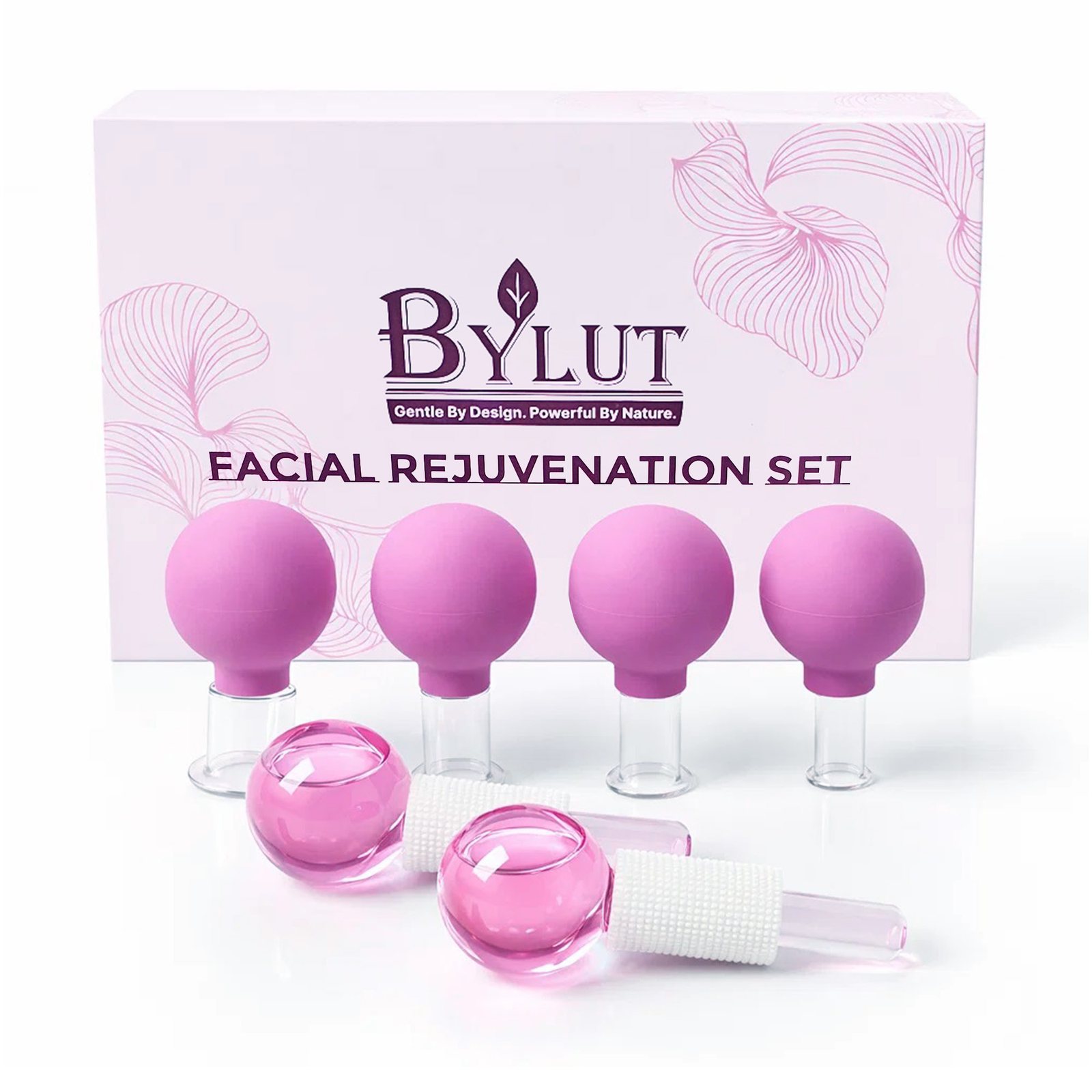
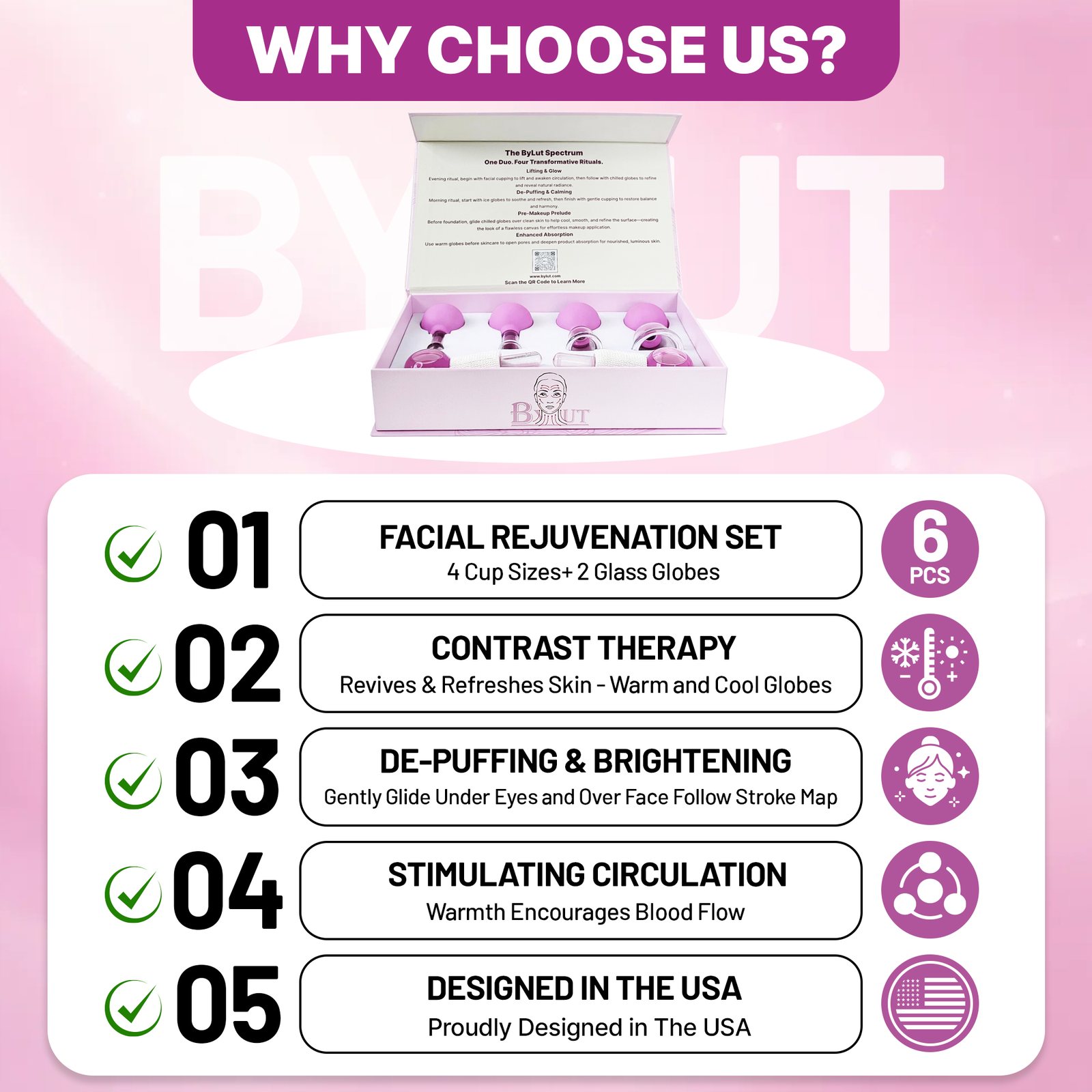
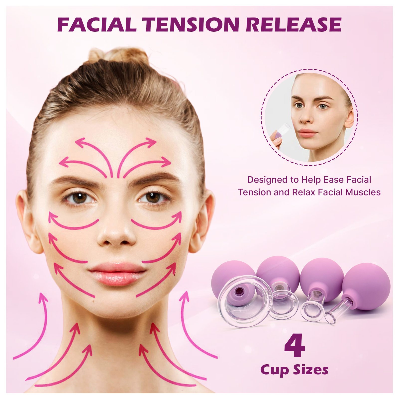
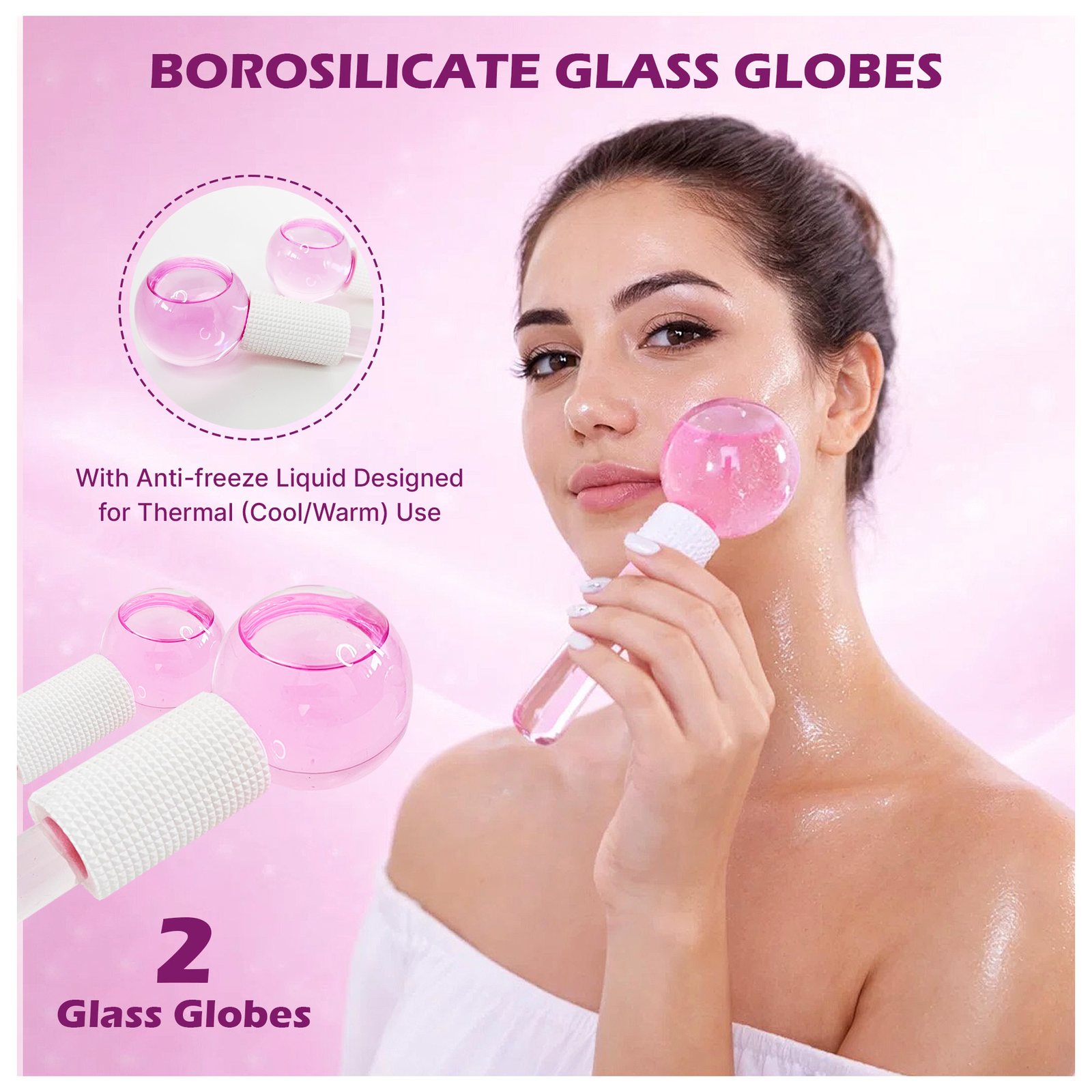
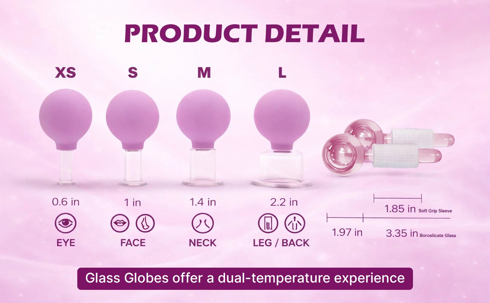
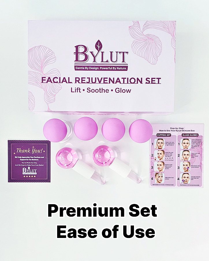
BYLUT’s line is “Gentle By Design. Powerful By Nature.” This project is the Facial Rejuvenation Set: four glass cupping cups with soft silicone bulbs, sized XS to L for eye, face, neck, and leg or back, plus two borosilicate glass globes for warm and cool use. The box reads “Lift · Soothe · Glow.”
On Amazon the product is listed as the ByLut 3-in-1 Ice Globes & Glass Facial Cupping Set — two ice globes and a four-size facial cupping set for face lifting, body suction, depuffing, and heat and cold therapy, in purple.
My Role
I designed the visual parts of the Amazon listing, then ran A/B tests on those visuals.
The design covers three listing surfaces: the main image gallery, A+ Content below the buy box, and the Brand Story. The tests compared alternate treatments of the main image, the secondary images, and the A+ modules.
Challenge
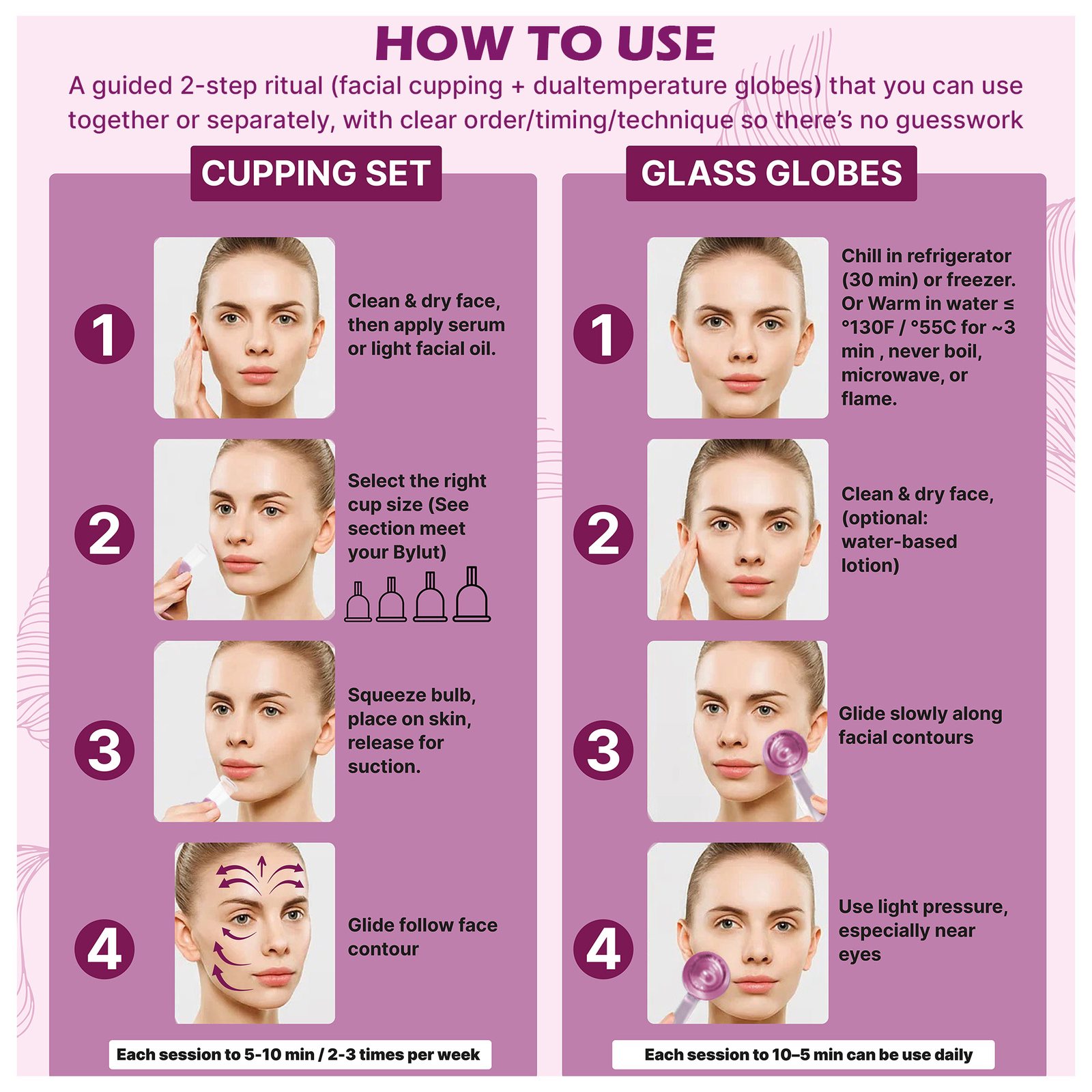
The set is several tools in one box: four cup sizes, two globes, a printed routine card, and gift-ready packaging. The first image still has to read as a single product on a white Amazon thumbnail. Later images have to explain size, where each cup is used, how to glide, and how the globes switch between cold and warm, without breaking the purple brand.
The A+ modules and Brand Story then have to carry the same identity into a wider, more editorial layout: spa lighting, a stroke map, and a short brand introduction.
Process
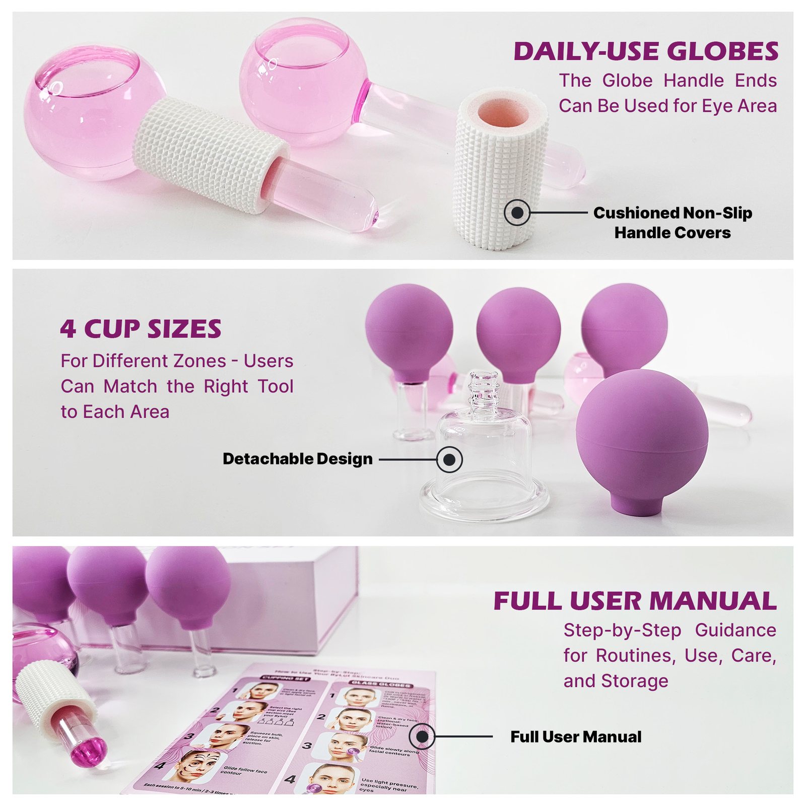
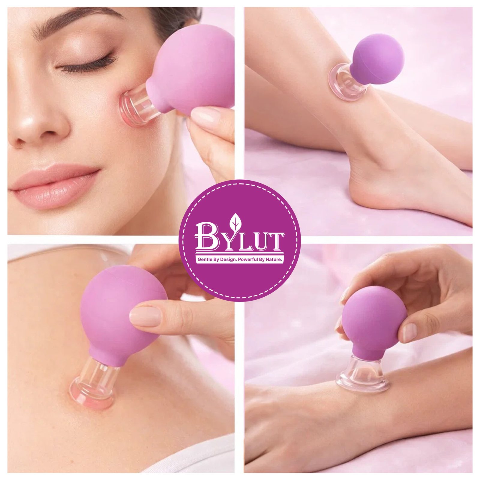
- Main images first. A clean white hero of the full set, then square infographics for benefits, cupping direction, the glass globes, a two-part how-to, feature callouts, and in-use frames for face and body.
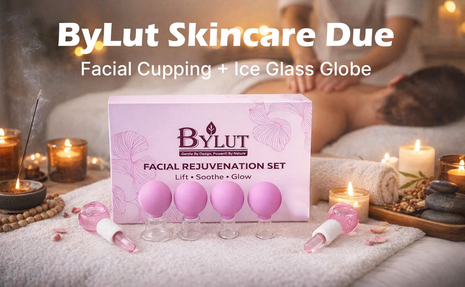
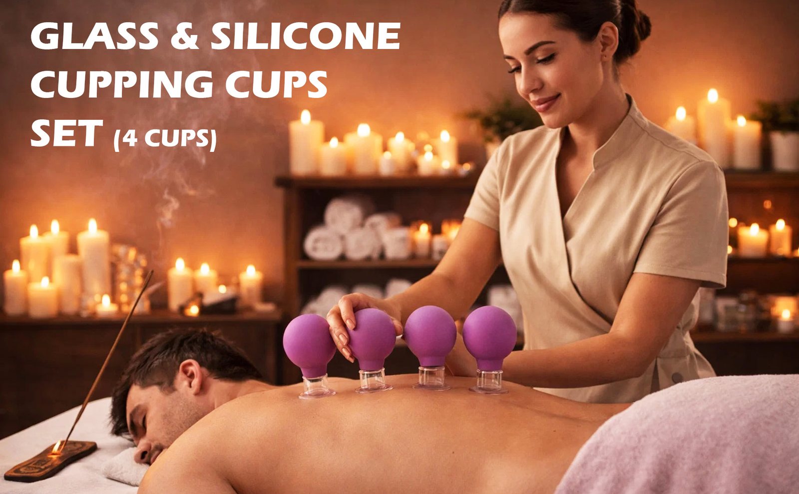
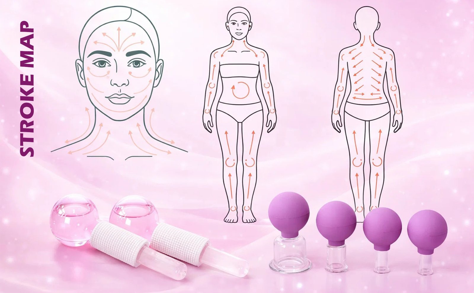
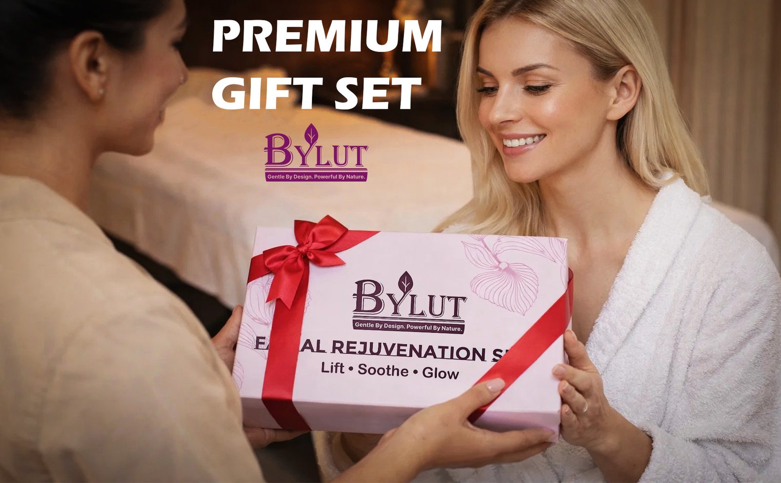
- A+ Content next. Wider modules for the spa scene, measured product detail, the four-cup body set, a stroke map, and the gift presentation.
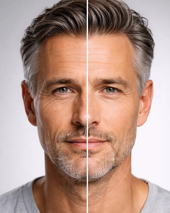
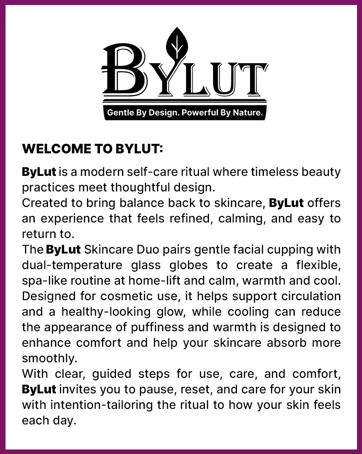
- Brand Story last. A pink brand field, a welcome card in the brand’s own words, product cards, and portrait cards.
- After the visuals were on the listing, A/B tests on the main image, the secondary images, and the A+ modules.
Main Images
Seven square listing images. The hero stays on white so the set is clear at thumbnail size. The frames after it teach the routine.
A+ Content
Wide modules under the listing. The logo bar leads, then lifestyle, measurements, body use, a stroke map, and gifting.

Brand Story
Amazon Brand Story uses a wide brand image and a row of cards. The field is the same pink and plum as the packaging. The welcome card is set in BYLUT’s own words.
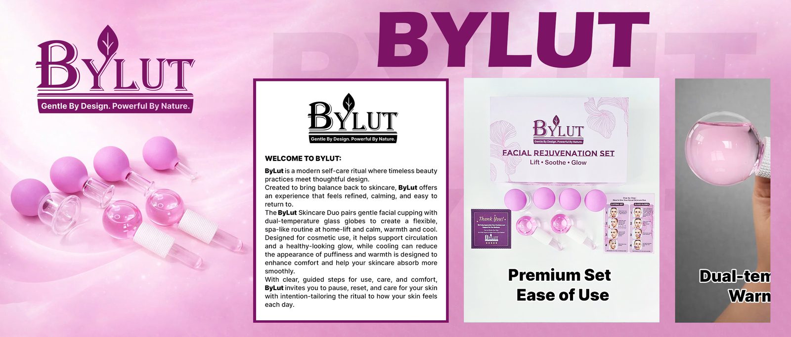
Cards
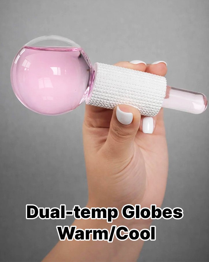
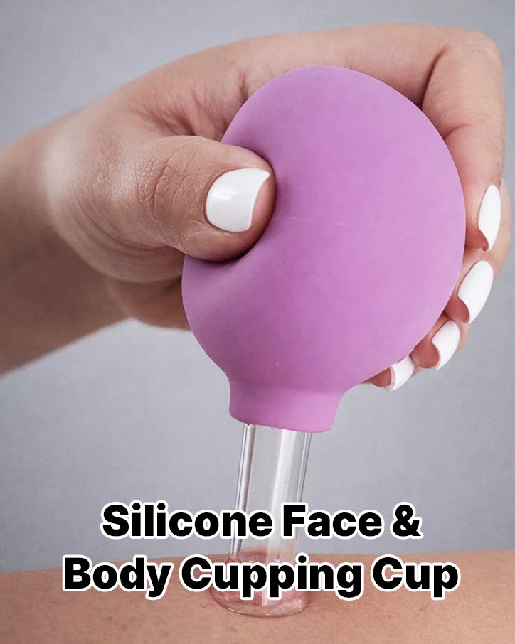
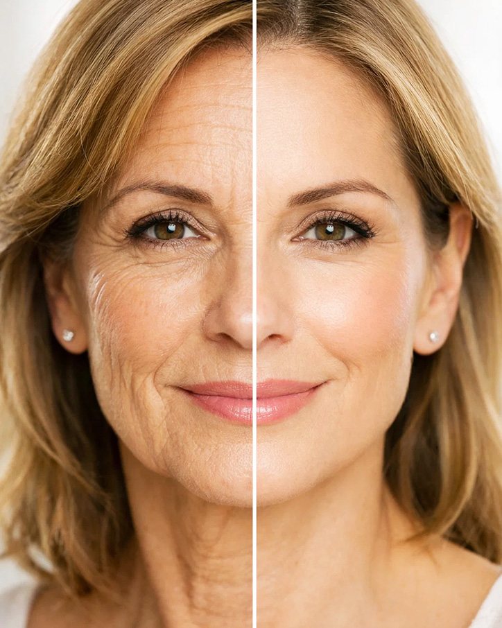
A/B Testing
After the visuals were designed, they were A/B tested with Amazon’s listing experiments. Each test compared one visual treatment with another on the same part of the listing: the main image, the secondary images, and the A+ modules.
The tests were there to learn which treatment shoppers responded to. This page does not report a winner or a metric. Those stay in the experiment history.