A full visual system for ZIBRRO’s Amazon listing: the main image set, A+ Content, and Brand Story for an 8×10 vintage picture frame that hangs on a wall or stands on a table. The same visuals were then A/B tested on the listing.
Overview
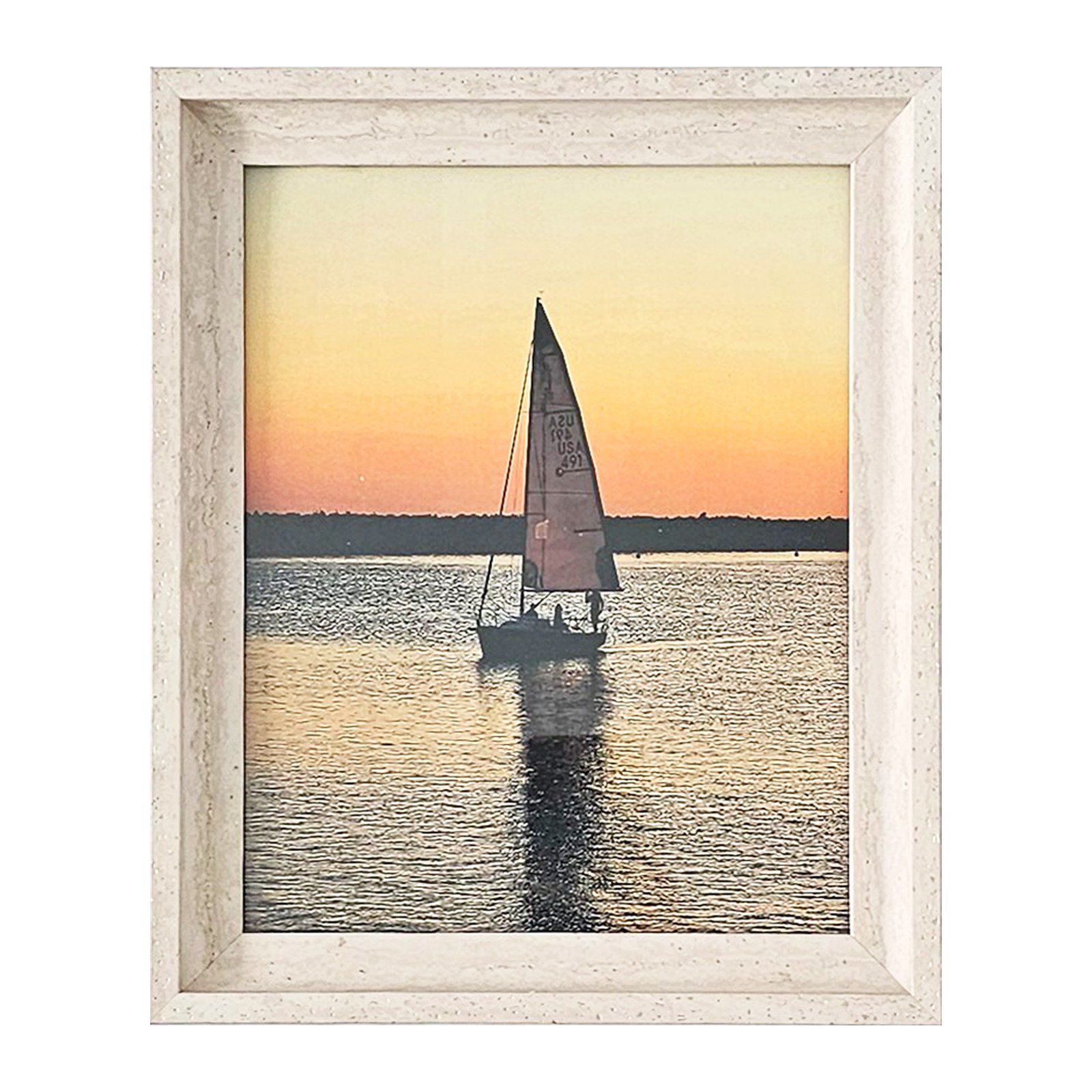
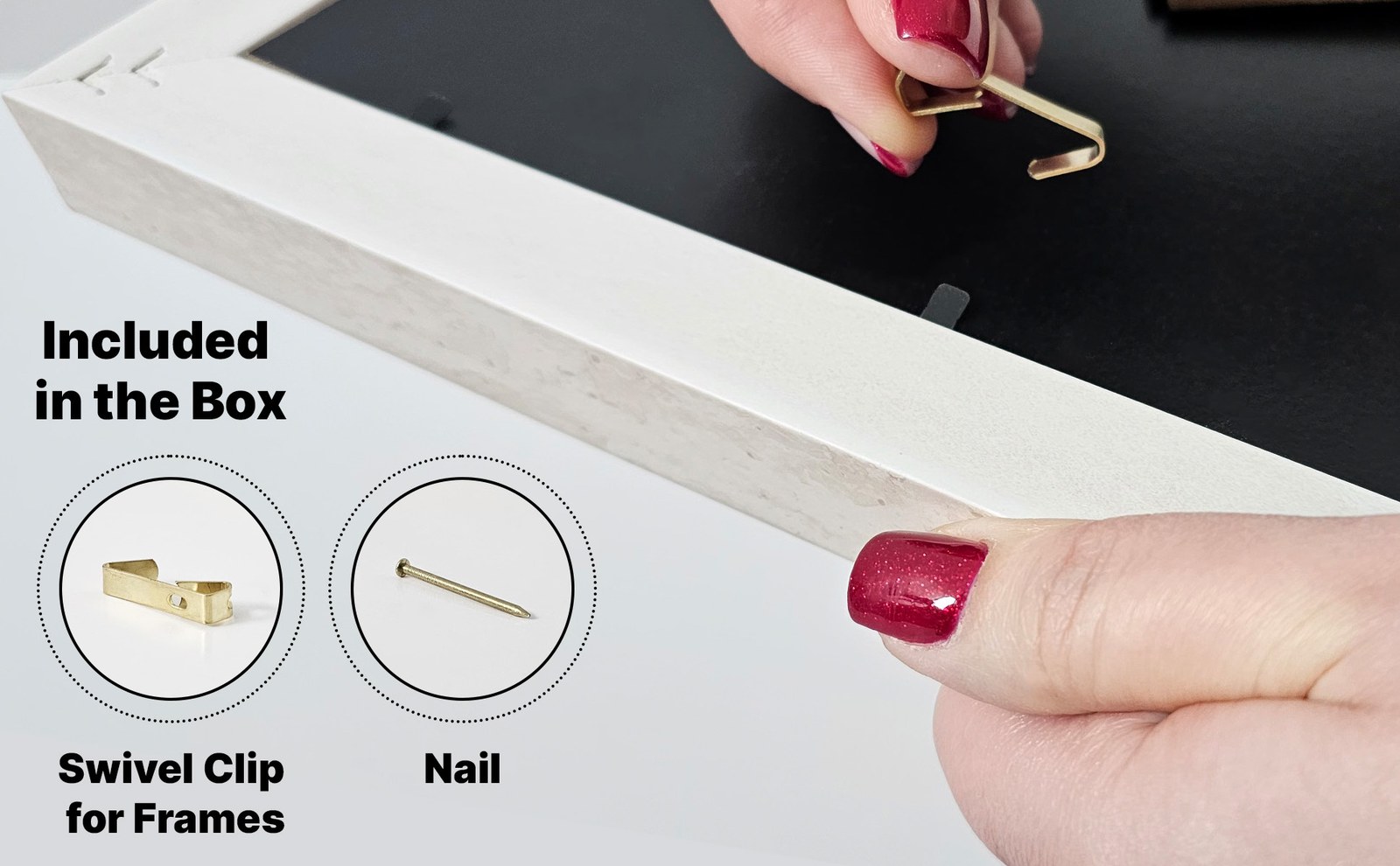
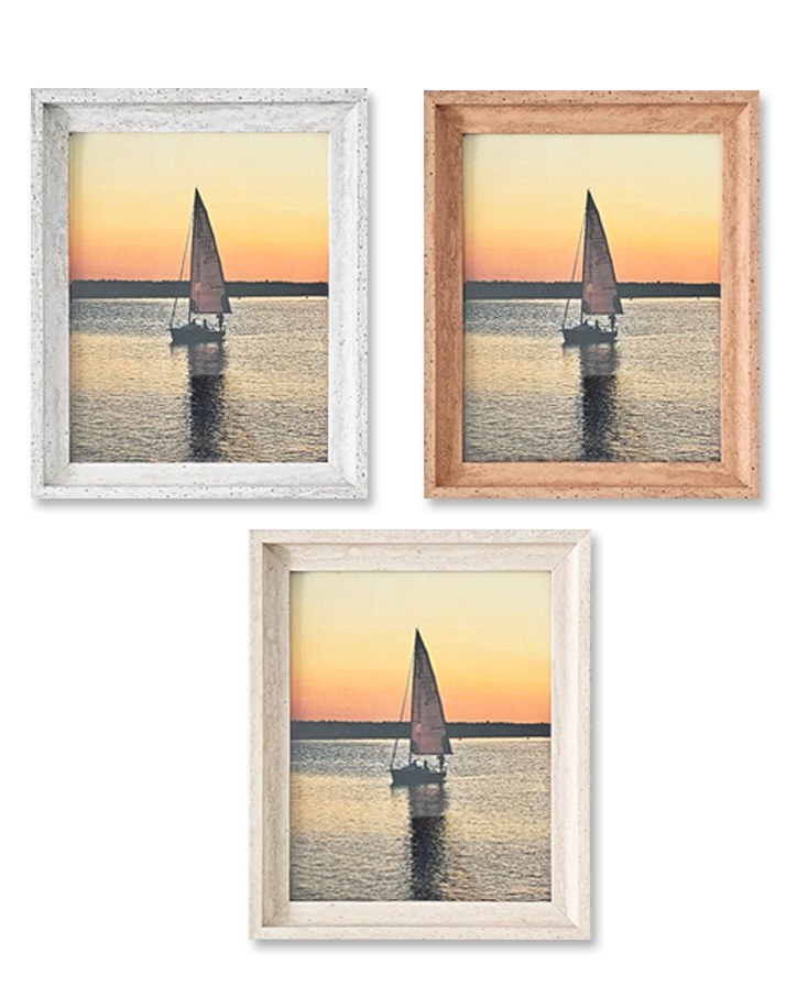
ZIBRRO sells picture frames built around elegance, durability, and style, for home décor, office spaces, and special gifts. This project is its 8×10 vintage picture frame, shown in White Vintage, Gray, and Brown finishes, with an easel back for the tabletop and a swivel clip and nail for the wall.
On Amazon the product is listed as an 8×10 wedding and family picture frame with a white vintage finish, for wall hanging or tabletop display, and a good fit for wedding and birthday gifts.
My Role
I designed the visual parts of the Amazon listing, then ran A/B tests on those visuals.
The design covers three listing surfaces: the main image gallery, A+ Content below the buy box, and the Brand Story. The tests compared alternate treatments of the main image, the secondary images, and the A+ modules.
Challenge
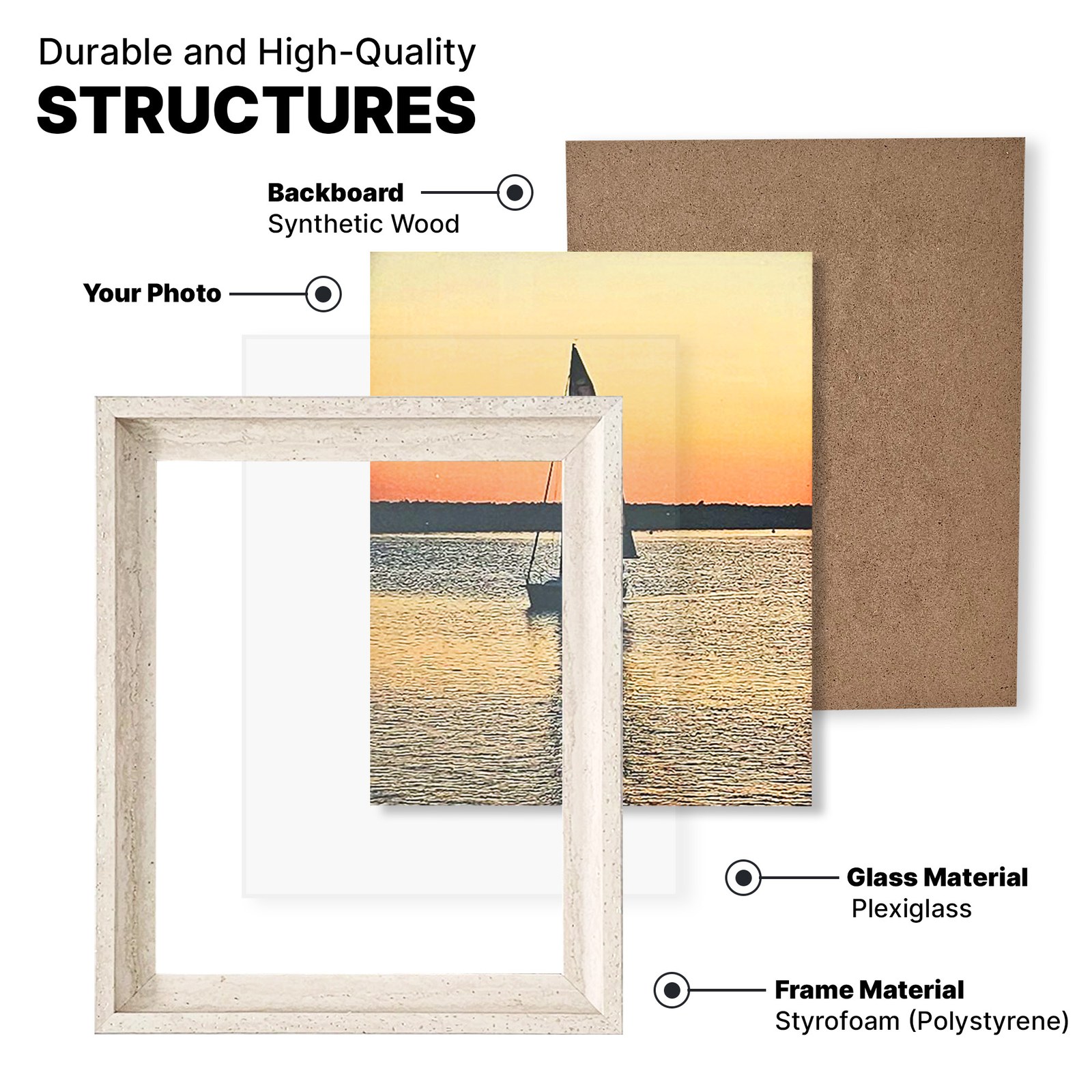
A picture frame is easy to ignore: a rectangle around someone else’s photo. The images had to show what makes this one worth choosing: the speckled vintage finish, the layers behind the glazing, the easel back that lets it stand or hang, and the three color options.
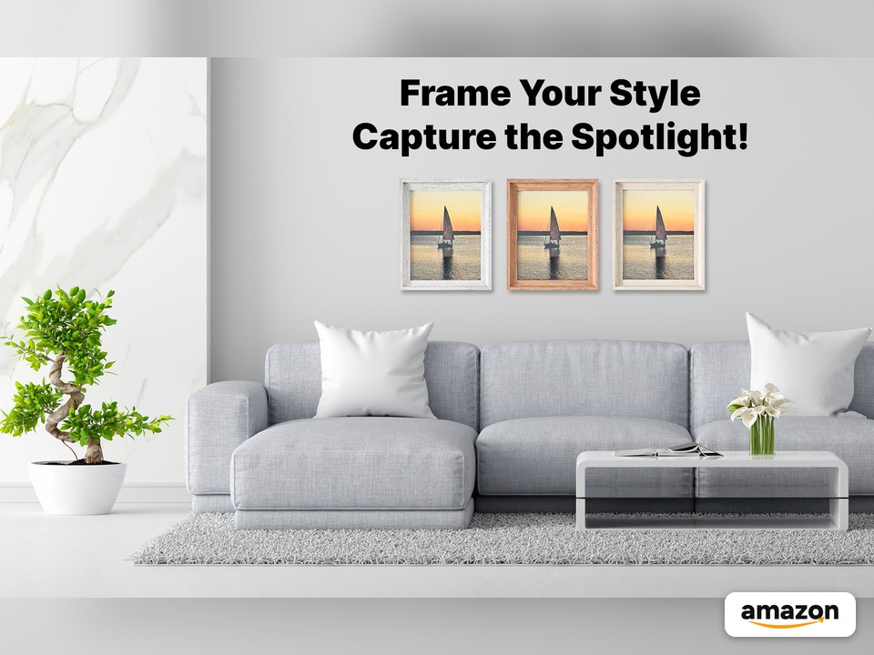
The frame also has to look right in real rooms. The A+ modules and Brand Story therefore move from product facts to settings and occasions: a living-room wall, a console table, a desk, a nursery, and a gift.
Process
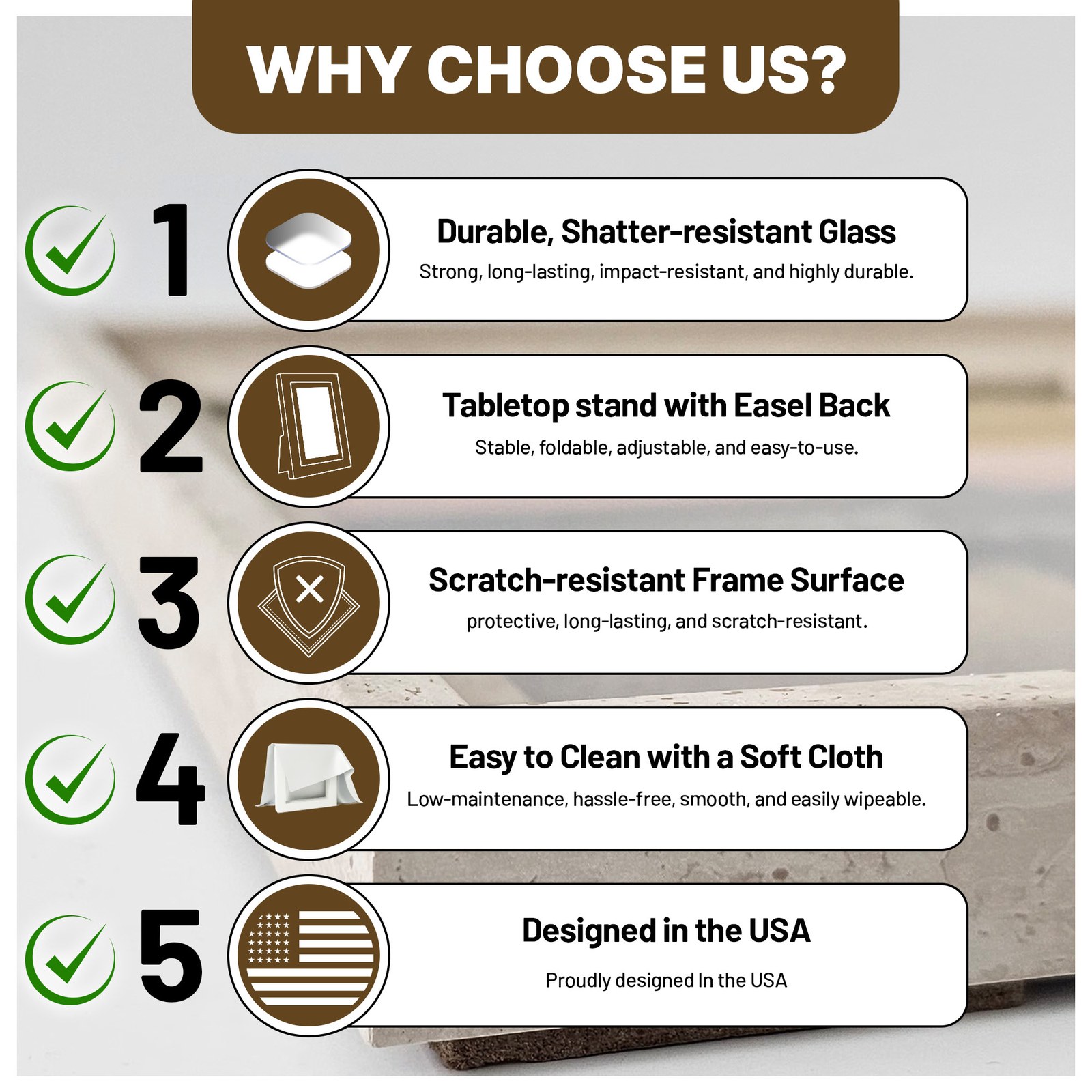
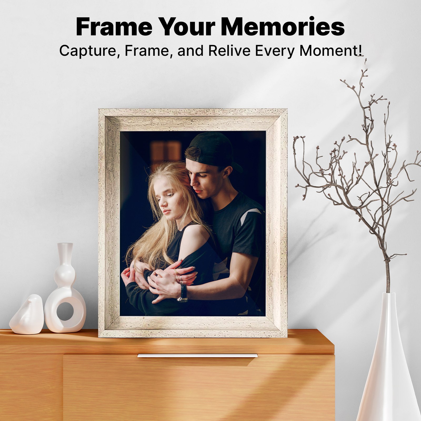
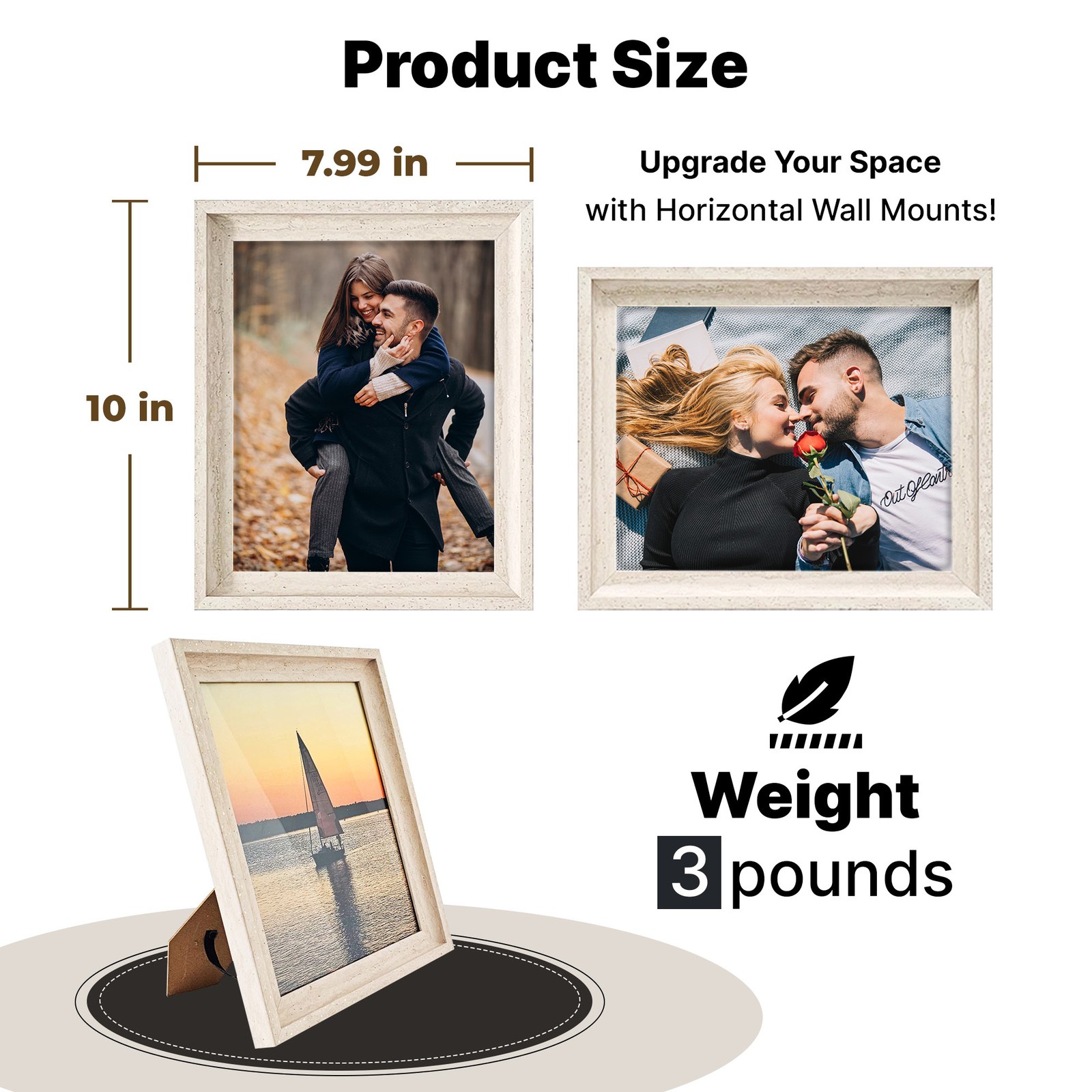
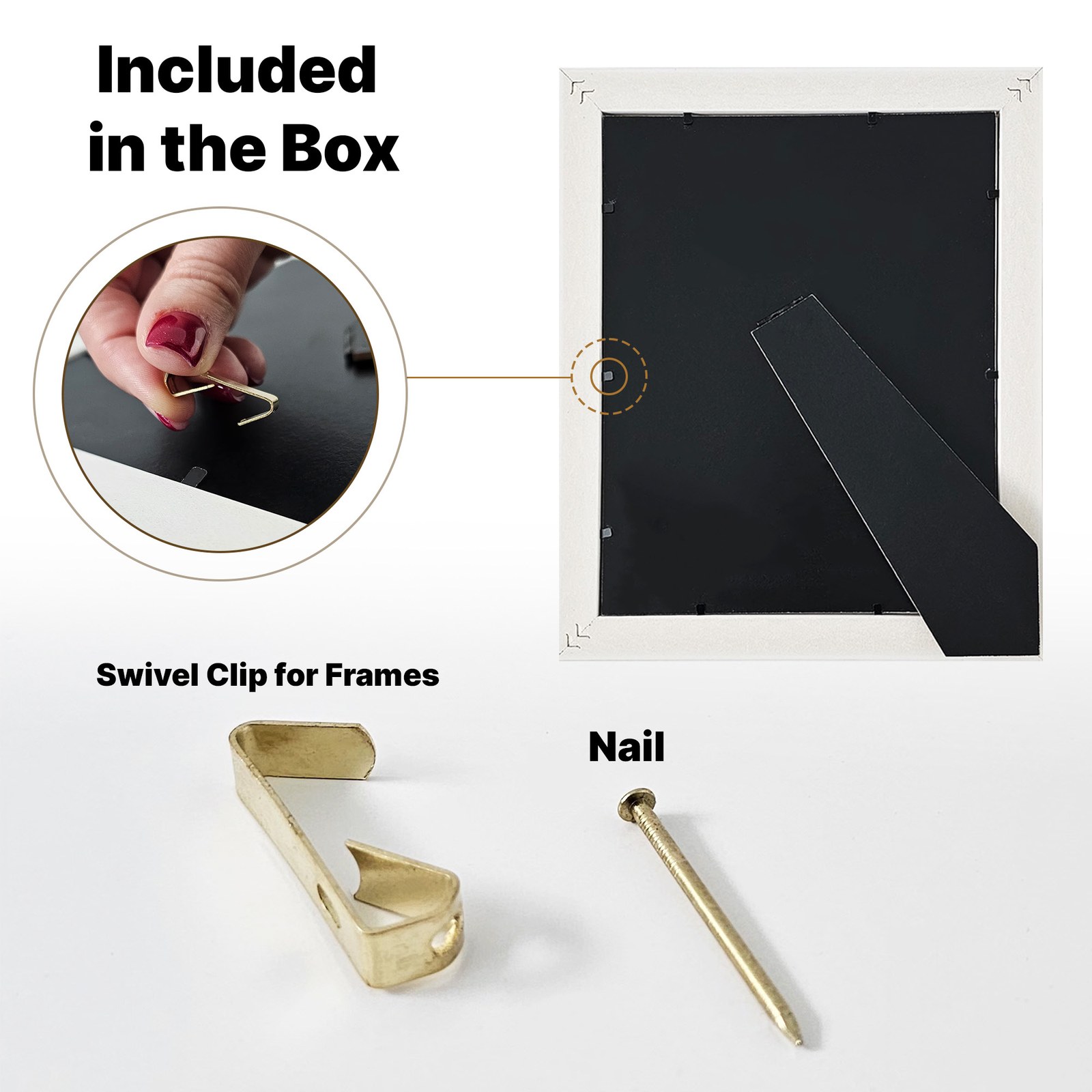
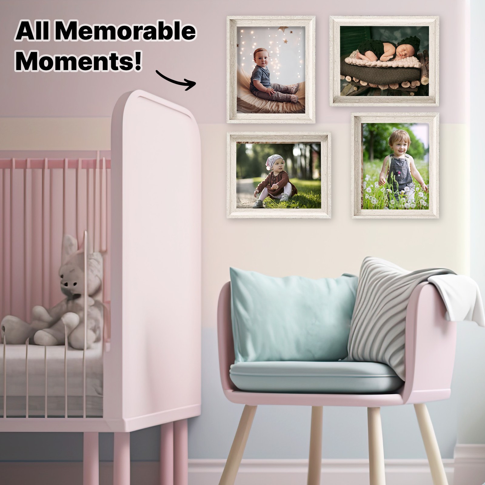
- Main images first. A clean white hero of the frame with a sunset print, then square images for the five reasons to choose it, an exploded view of the layers, a tabletop scene, the size, what comes in the box, and a nursery gallery wall.
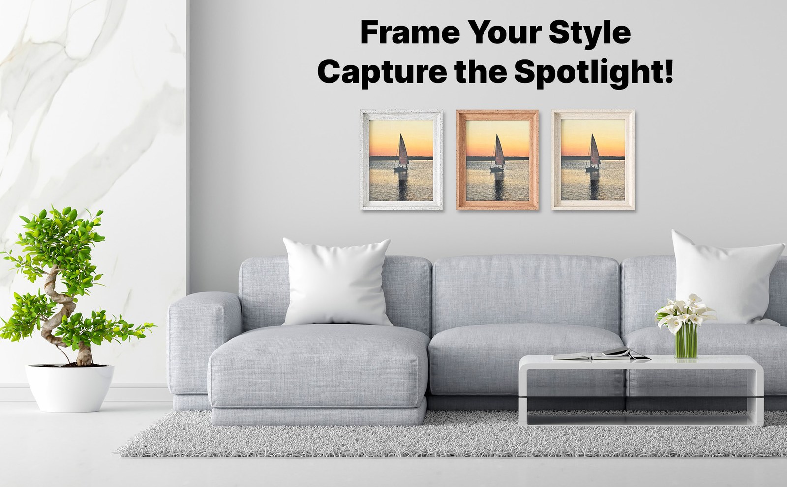
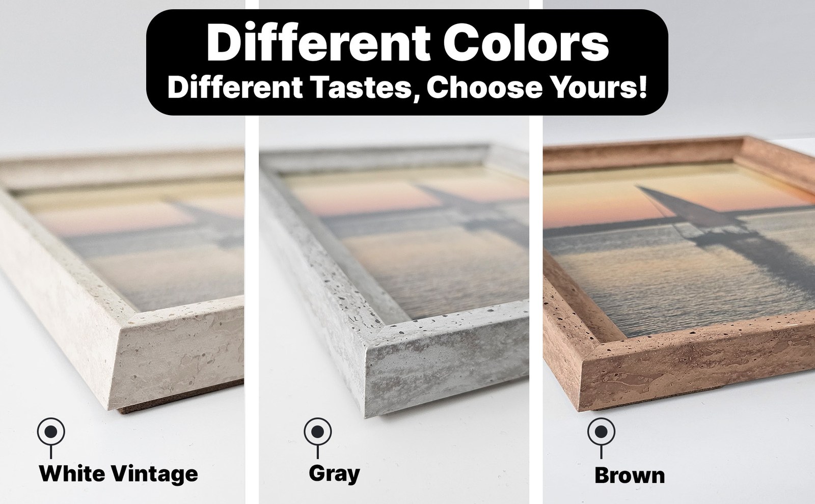
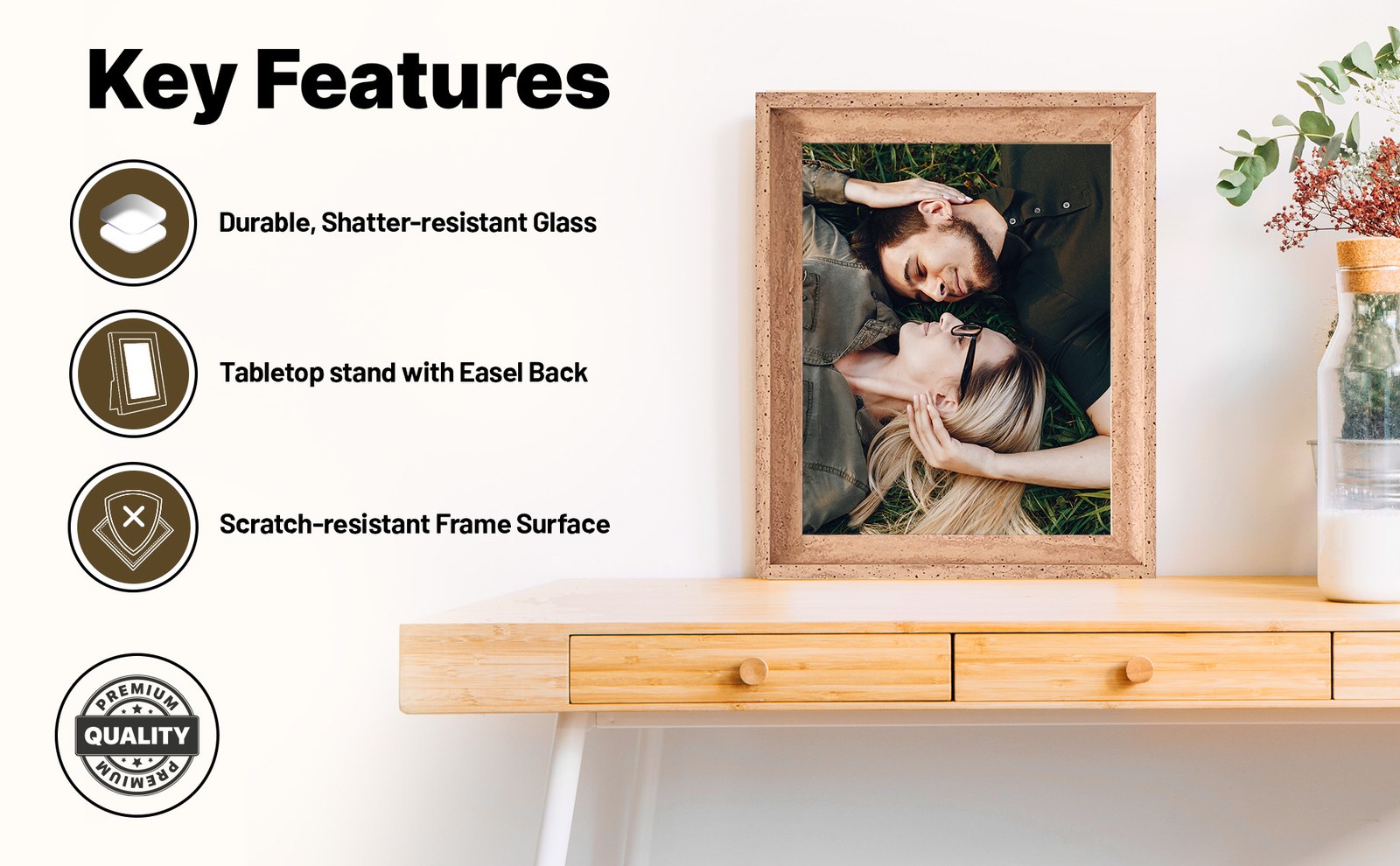
- A+ Content next. A logo bar, then wide modules for a living-room hero, the three colors, key features, the hanging hardware, and gifting.
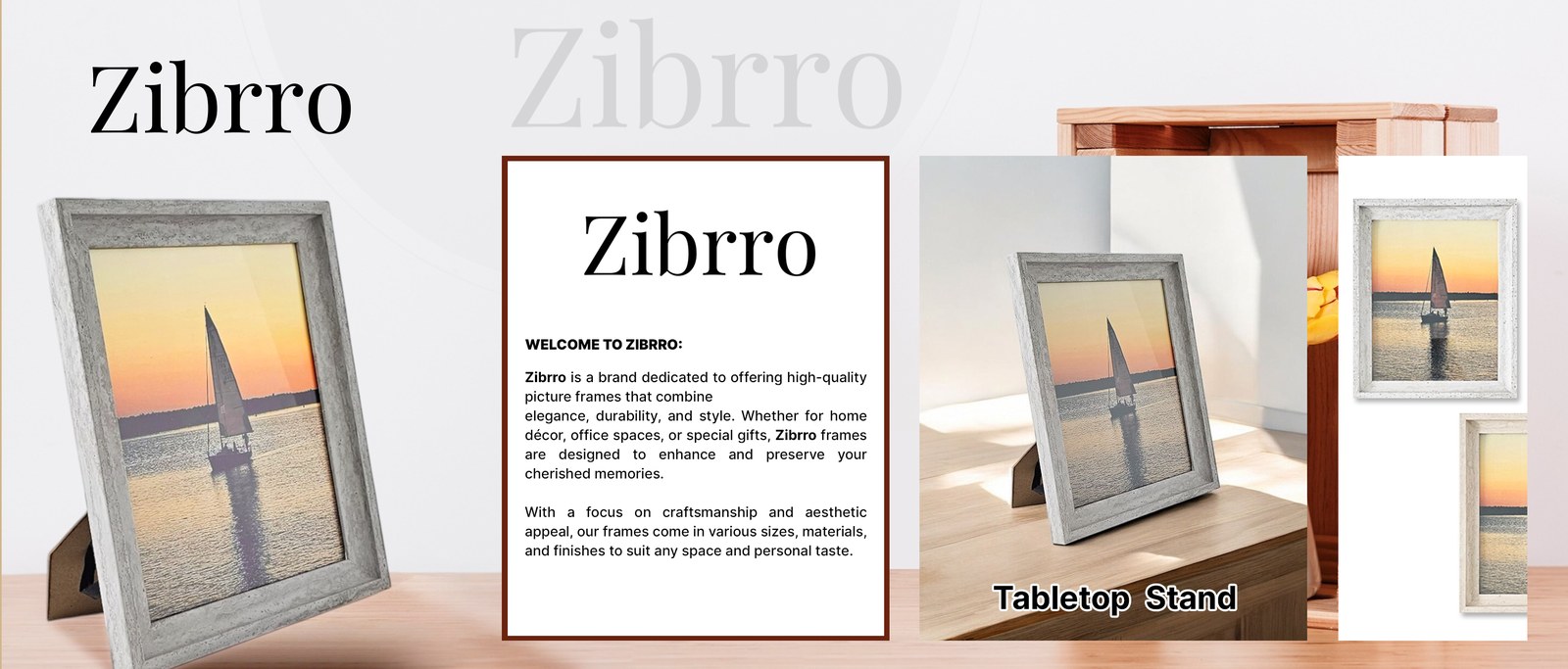
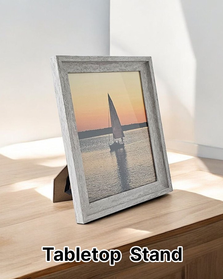
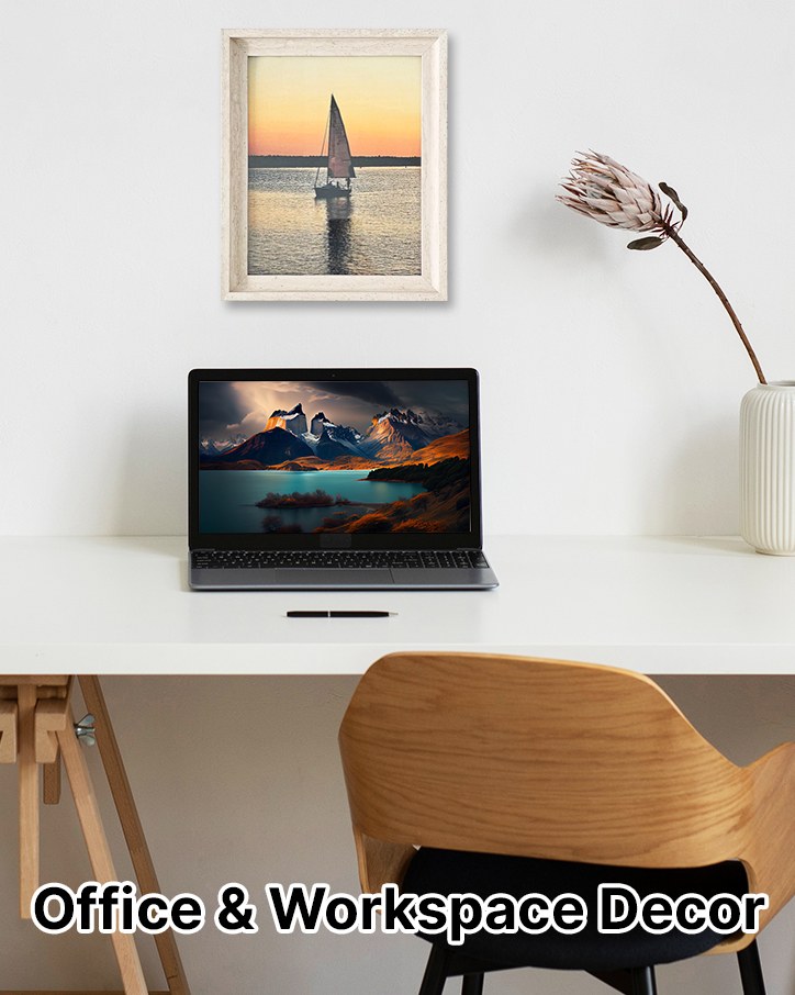
- Brand Story last. A bright tabletop brand field, a welcome card in the brand’s own words, and cards for gifting, tabletop use, office décor, and the finishes.
- After the visuals were on the listing, A/B tests on the main image, the secondary images, and the A+ modules.
Main Images
Seven square listing images. The hero stays on white so the frame’s finish is clear at thumbnail size. The frames after it answer the questions shoppers ask before buying a frame: what is it made of, how big is it, how does it stand or hang, and how will it look in a room.
A+ Content
Wide modules under the listing. The logo bar leads, then a living-room hero, the three colors, key features, the hardware in the box, and a gifting close.


Brand Story
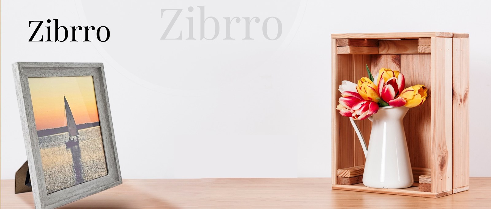
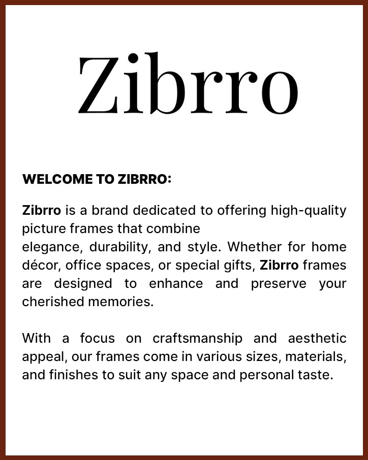
Amazon Brand Story uses a wide brand image and a row of cards. The field is a bright tabletop scene with a framed sailboat print, a wooden crate of tulips, and the Zibrro wordmark. The welcome card is set in ZIBRRO’s own words.
Cards

A/B Testing
After the visuals were designed, they were A/B tested with Amazon’s listing experiments. Each test compared one visual treatment with another on the same part of the listing: the main image, the secondary images, and the A+ modules.
The tests were there to learn which treatment shoppers responded to. This page does not report a winner or a metric. Those stay in the experiment history.