One visual system for PAASHLUX’s kitchen line on Amazon, covering two products: a 2-pack of 2-in-1 glass oil dispenser and sprayer bottles, and a glass tilted jar with a stainless steel date-indicator dial lid. Each product has its own main image set and A+ Content, tied together by one brand look and a shared Brand Story. The listing visuals were then A/B tested.
Overview
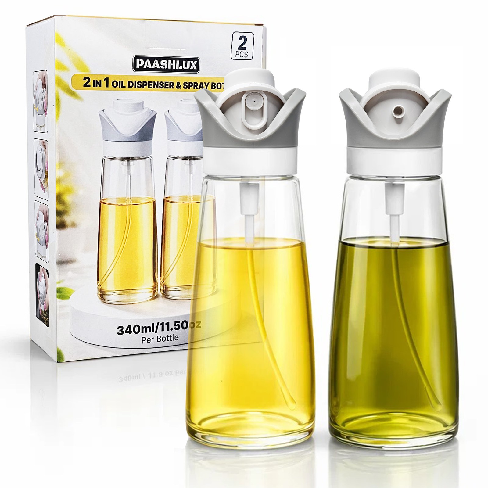
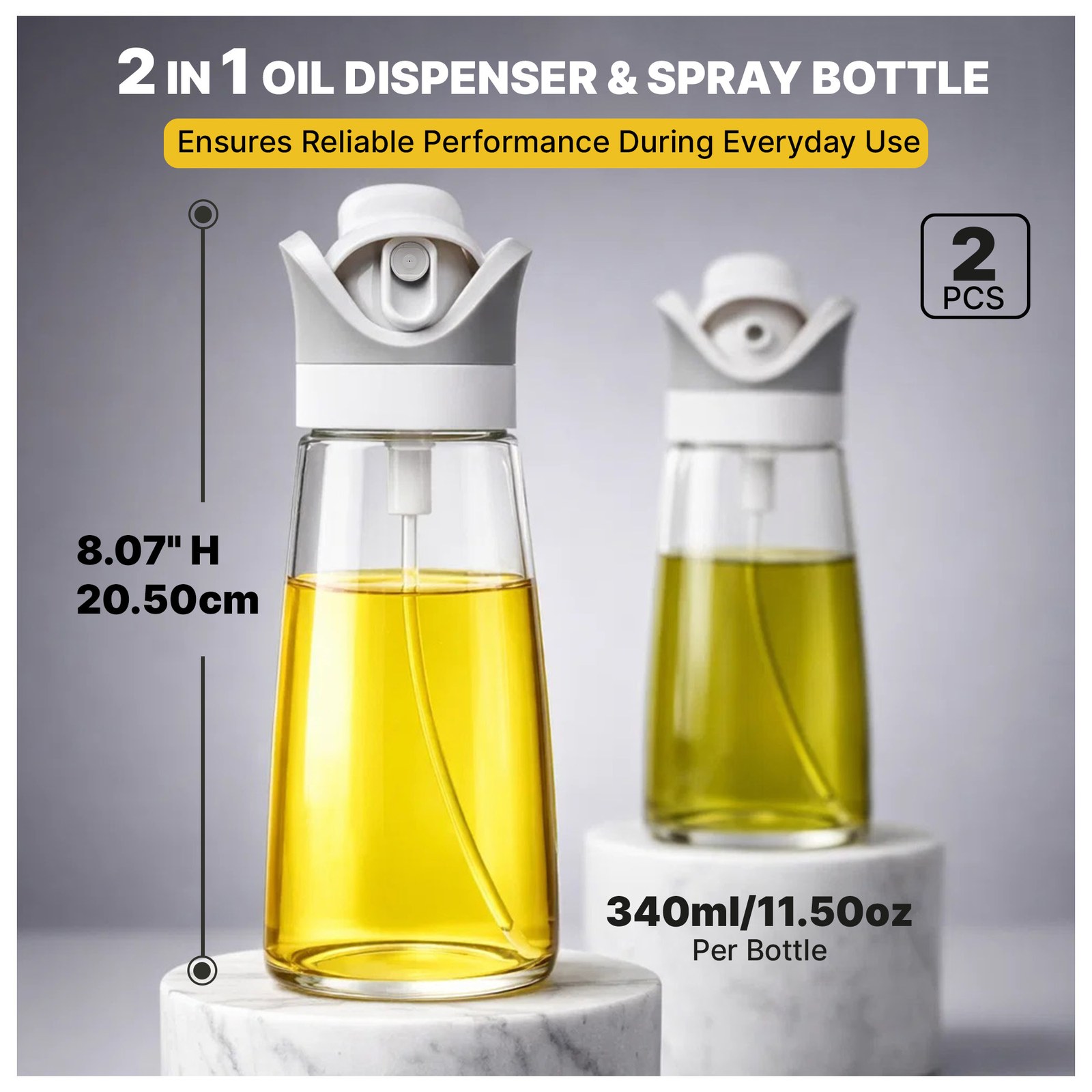
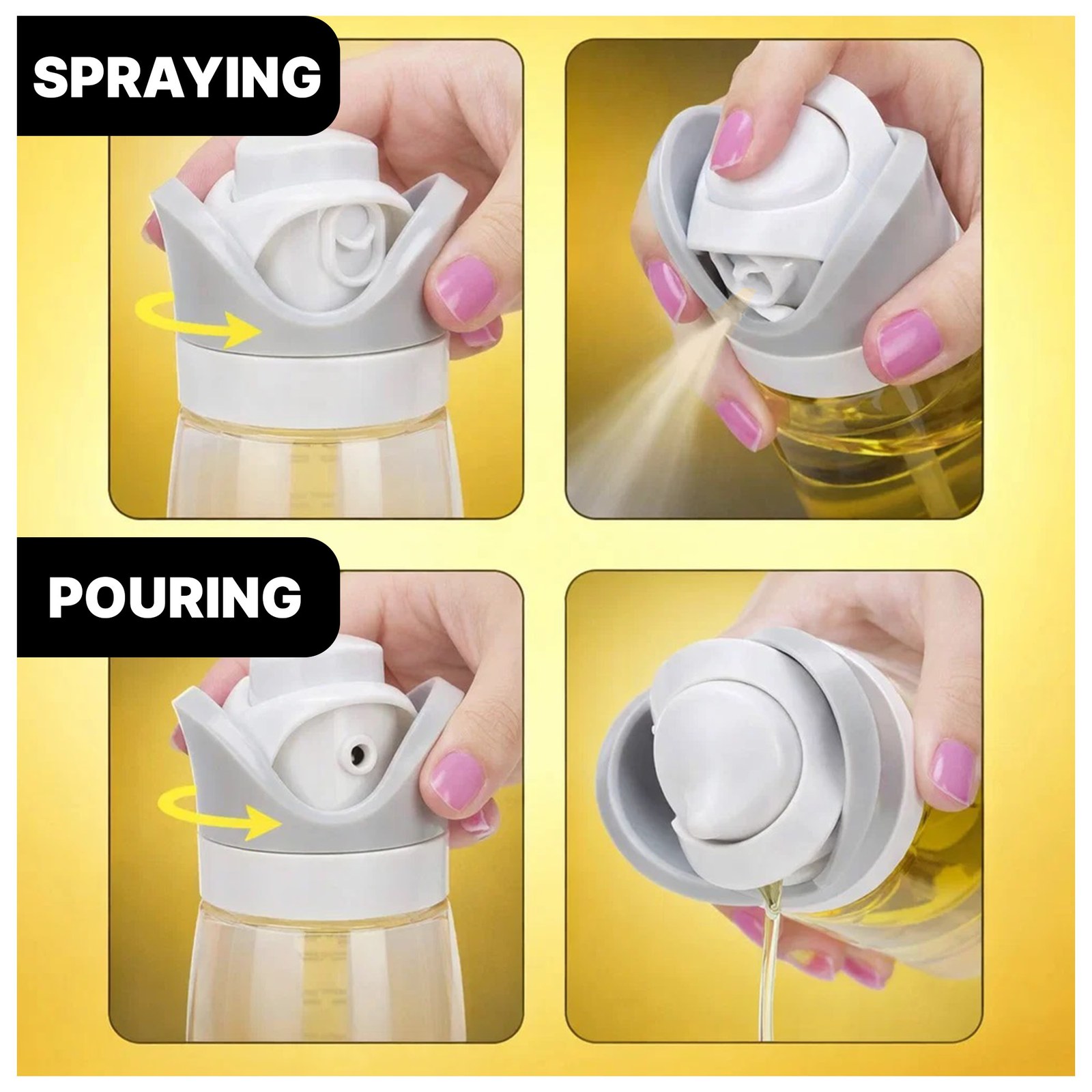
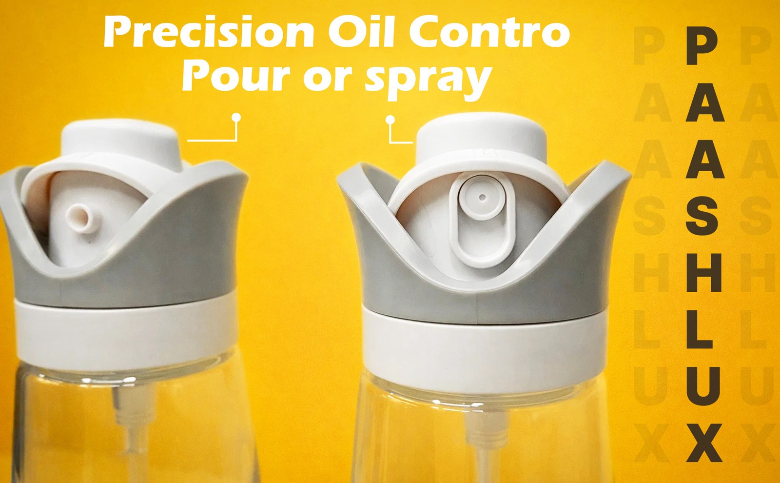
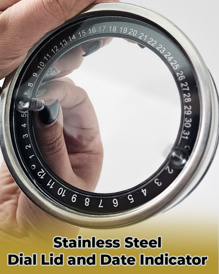
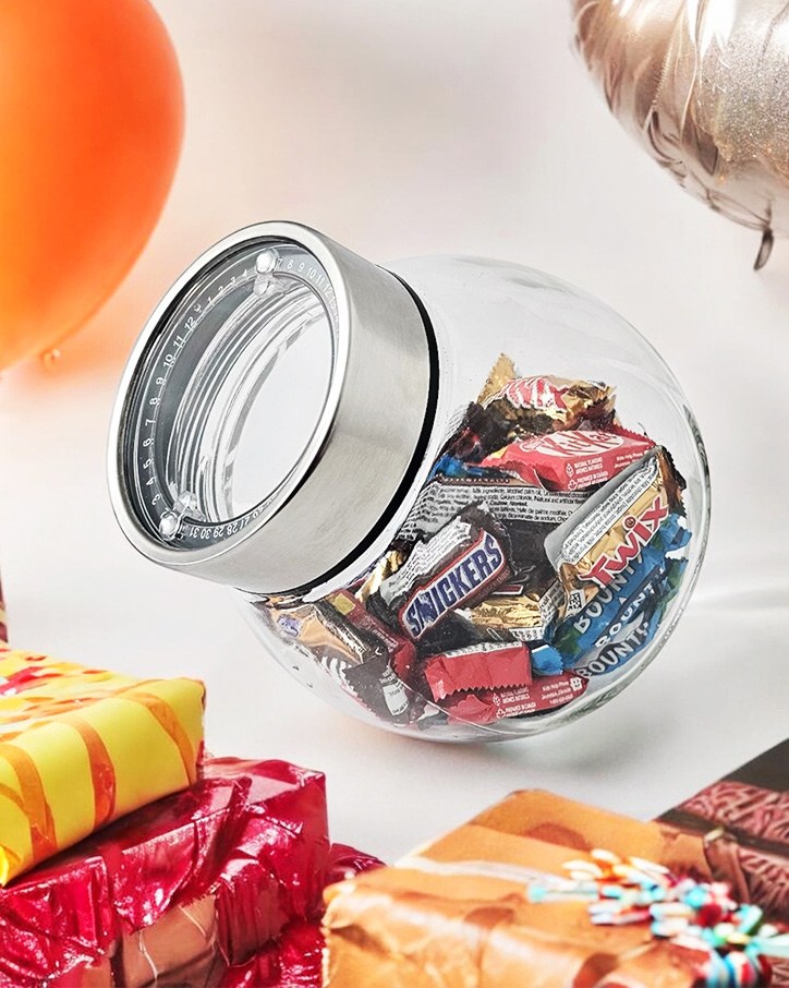
PAASHLUX sells “Smart. Simple. Kitchen Essentials.” This project covers two of them. The first is a 2-pack of 11.5 oz (340 ml) glass bottles whose lid twists between a pour and a fine mist, for salads, air fryers, grilling, and baking. The second is a glass jar that sits on an angle, with a stainless steel lid that has a date dial around a clear window to track freshness.
The oil sprayer set is listed on Amazon as the PAASHLUX Olive Oil Sprayer for Cooking, 2 In 1 Oil Dispenser and Sprayer, and that is the listing linked on this page.
My Role
I designed the visual parts of both Amazon listings, then ran A/B tests on those visuals.
The design covers three listing surfaces: the main image gallery and A+ Content for each product, and a Brand Story shared across the brand. The tests compared alternate treatments of the main image, the secondary images, and the A+ modules.
Challenge
Two different products had to read as one brand. Clear glass, olive oil, and grey spray tops sit very differently on screen from a glass jar with a steel lid, yet both needed the same clean kitchen feel, the same black wordmark, and the same gold-and-yellow accents.
Each product also had its own selling point to land in a thumbnail: the twist between pouring and spraying for the bottles, and the tilted opening and date dial for the jar. Glass photographs with reflections and is easy to lose on white, so the images had to keep the shape and the liquid or contents clear.
Process
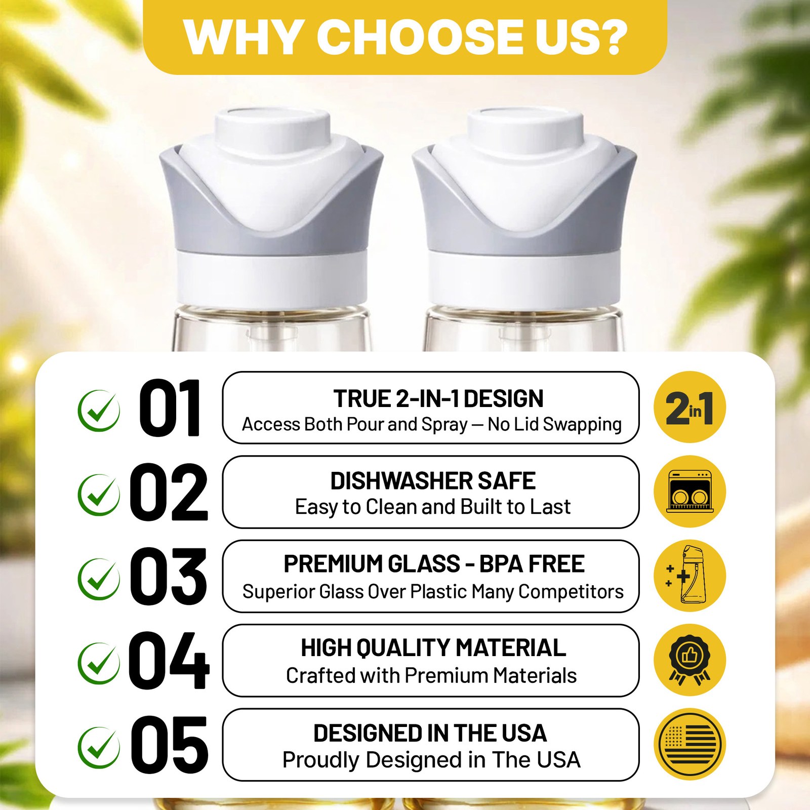
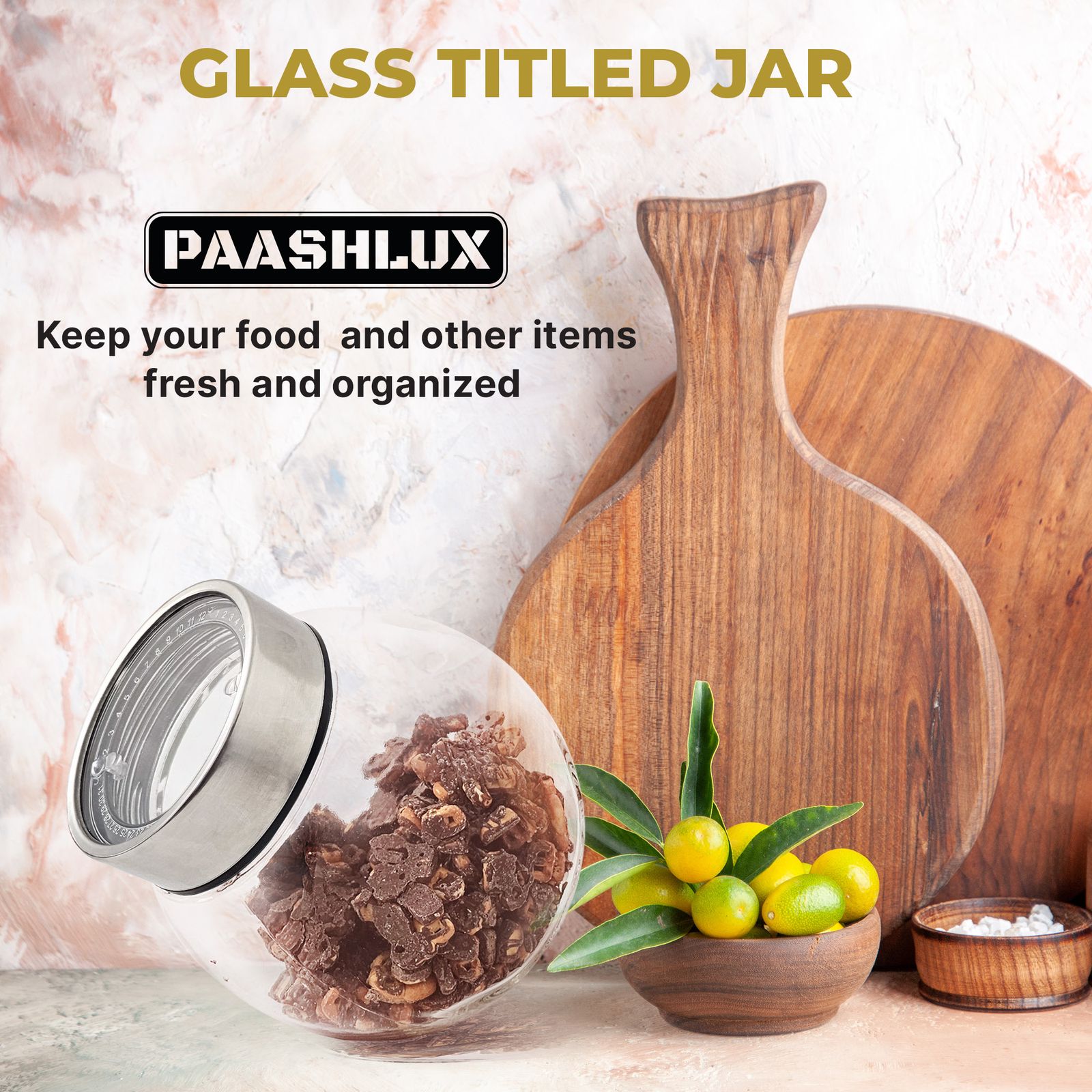
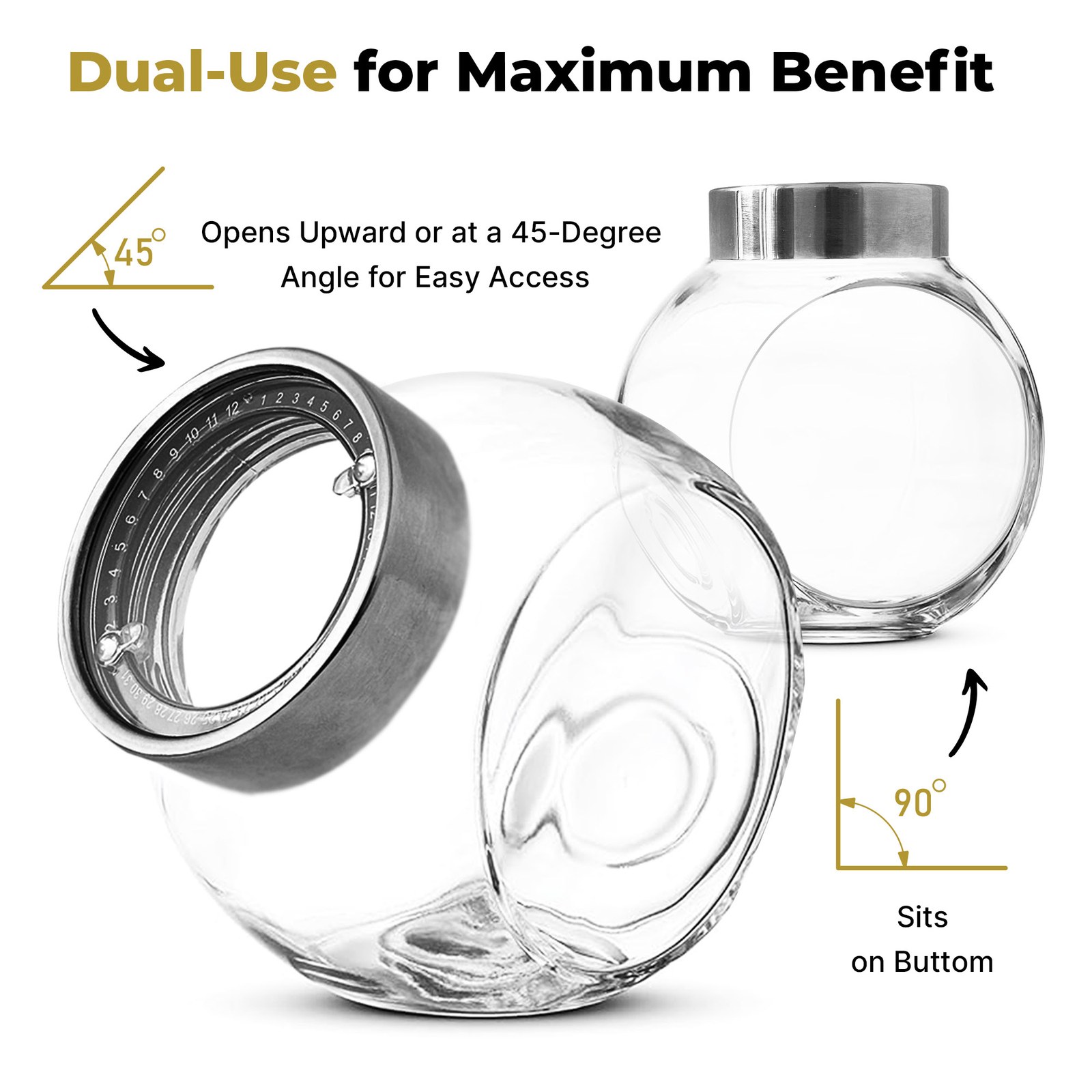
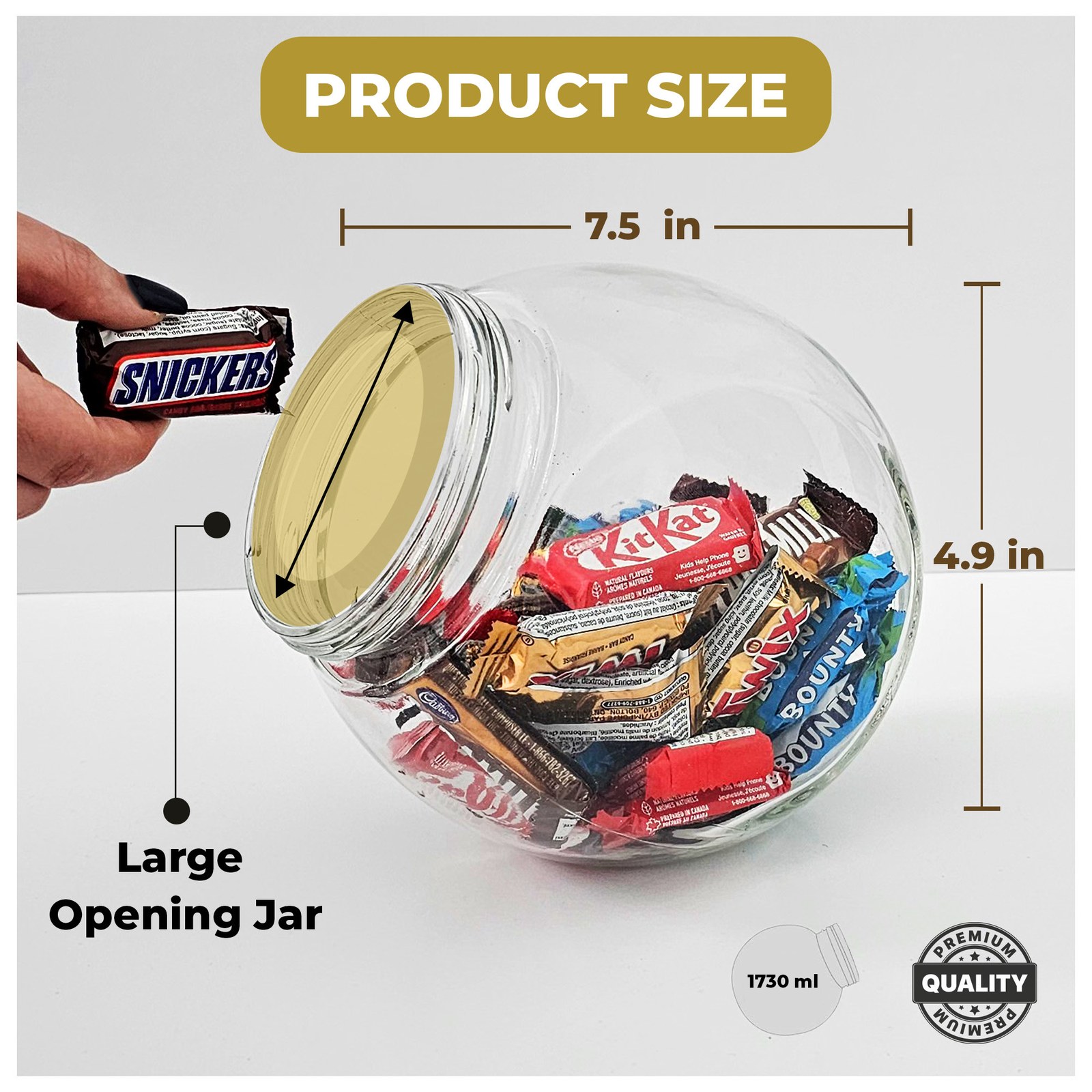
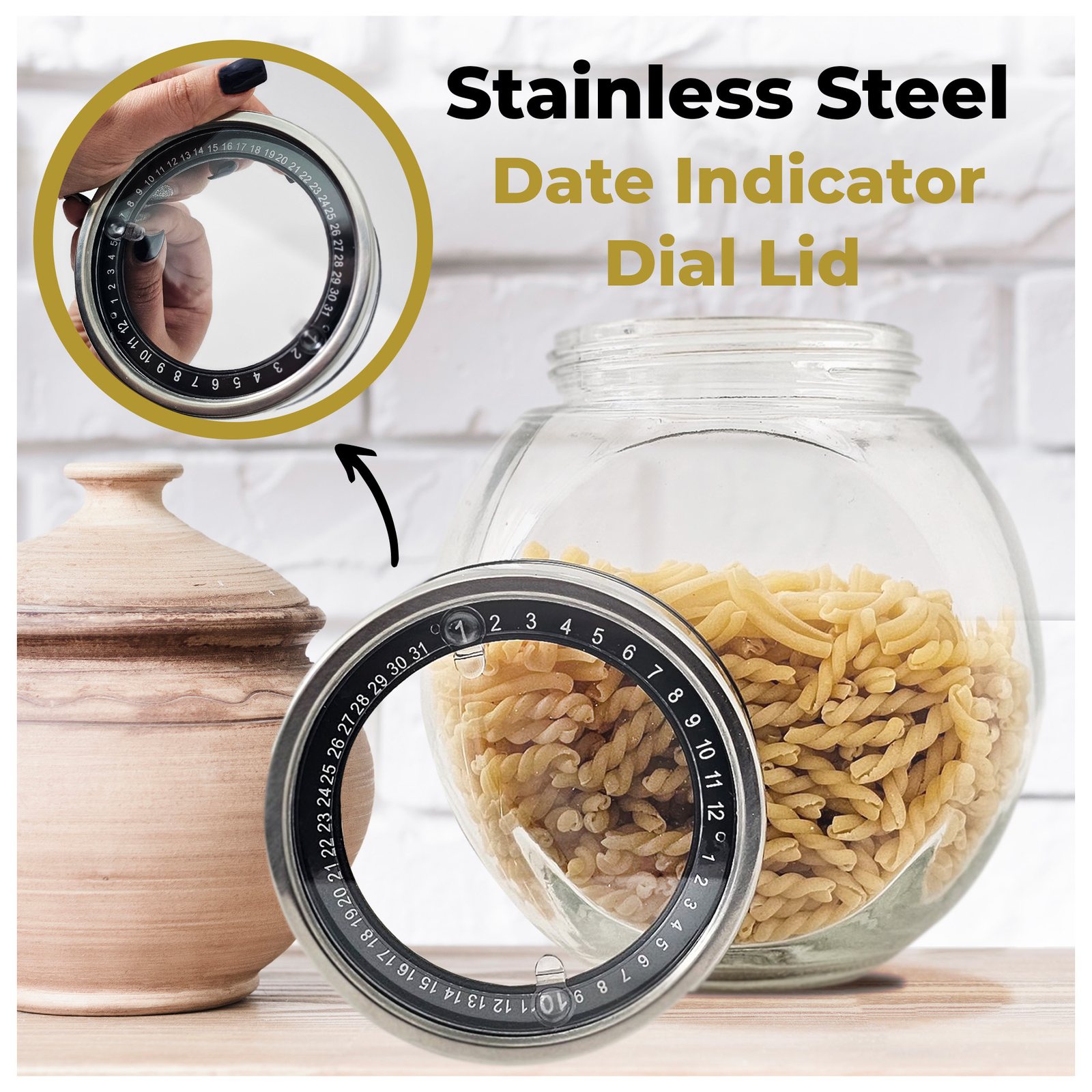
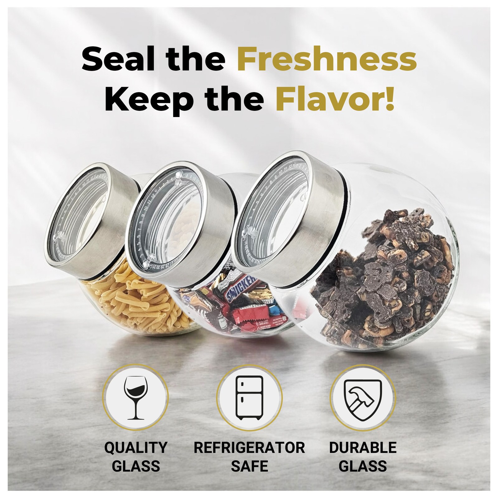
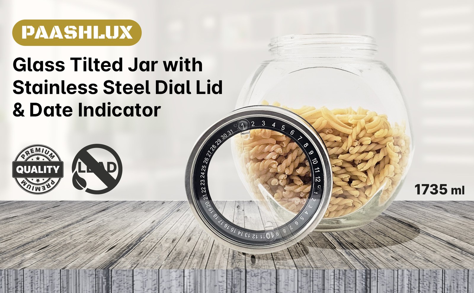
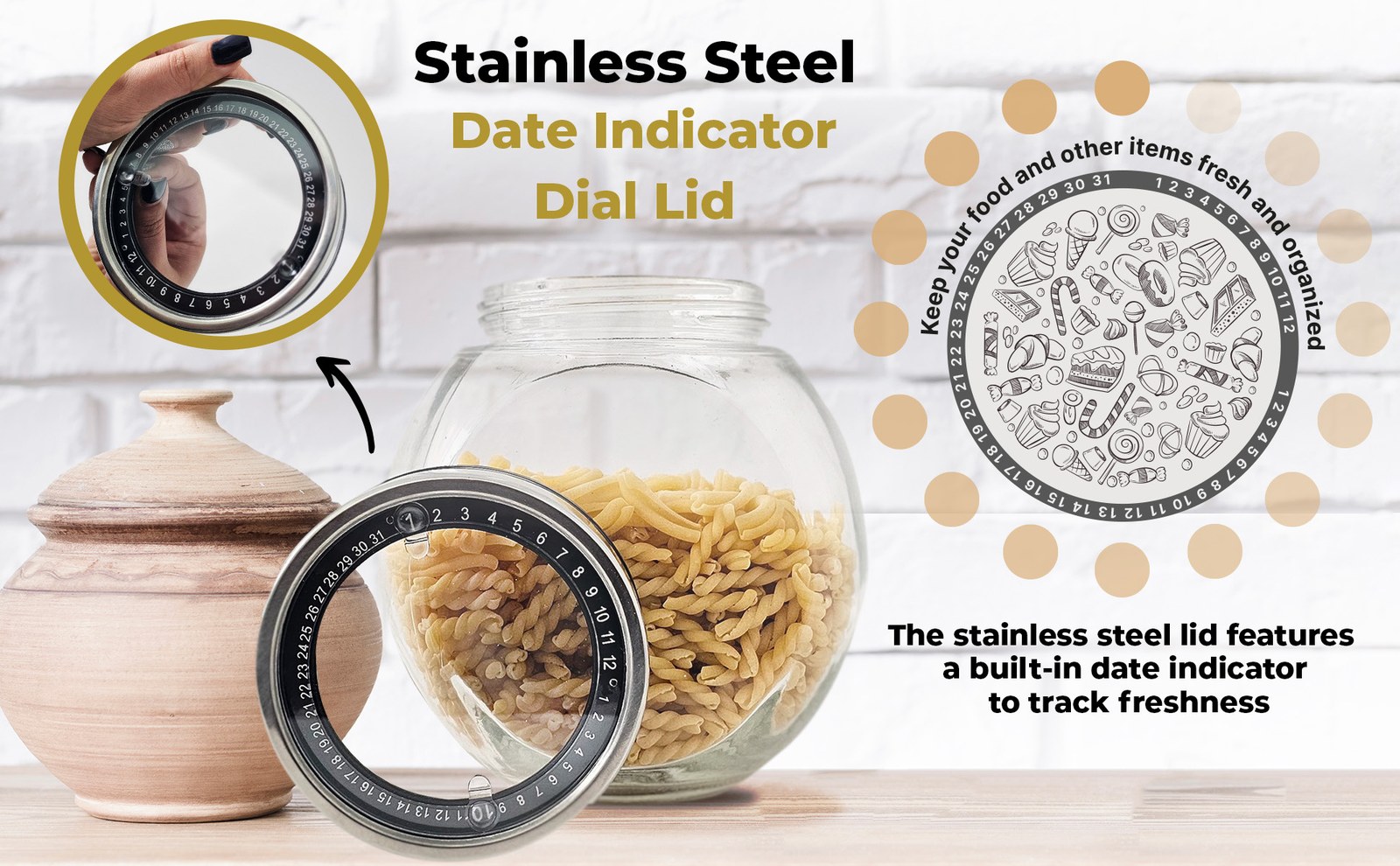
- Main images for each product. A white-background hero, a “why choose us” reasons image, size, and then the feature that sets that product apart: spraying versus pouring for the bottles, and the 45° opening and date dial for the jar.
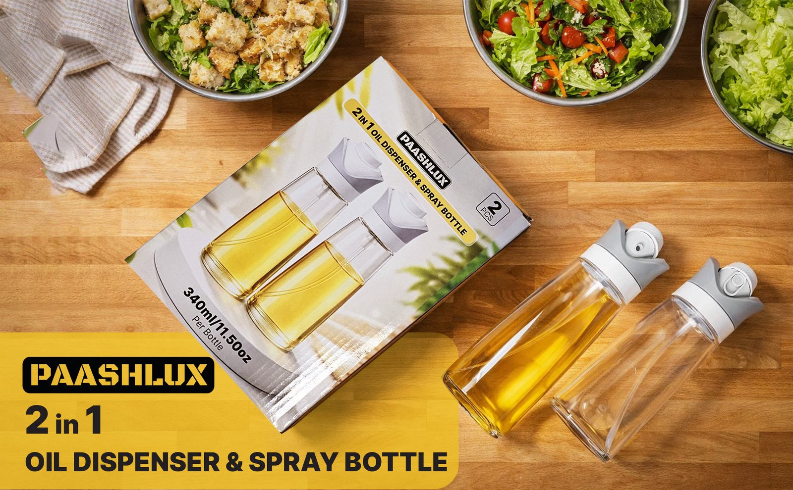
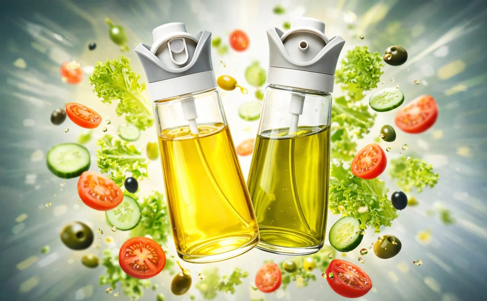
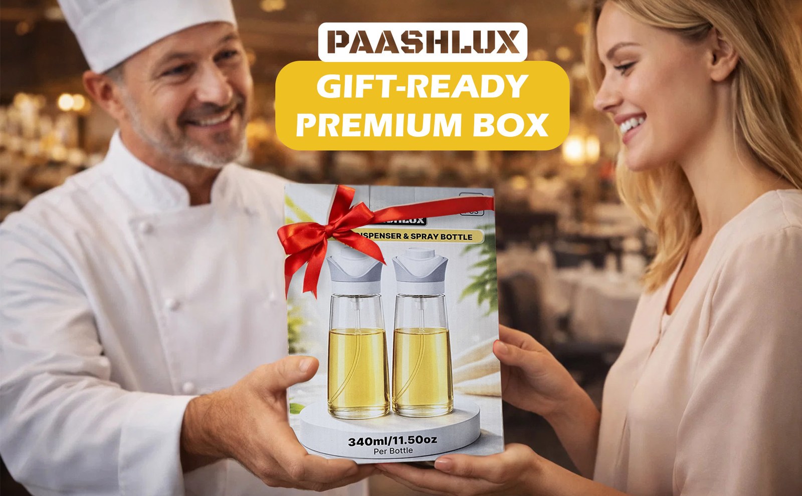
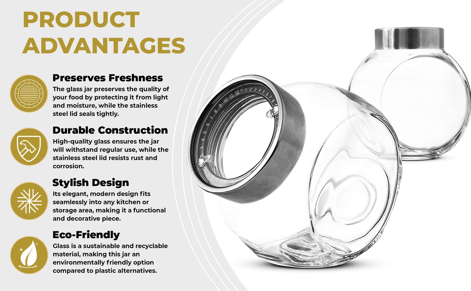
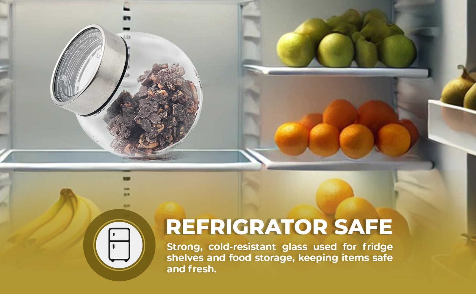
- A+ Content for each product. A PAASHLUX logo bar, then wide modules for the hero, the key feature, the ingredients or storage context, and gifting.
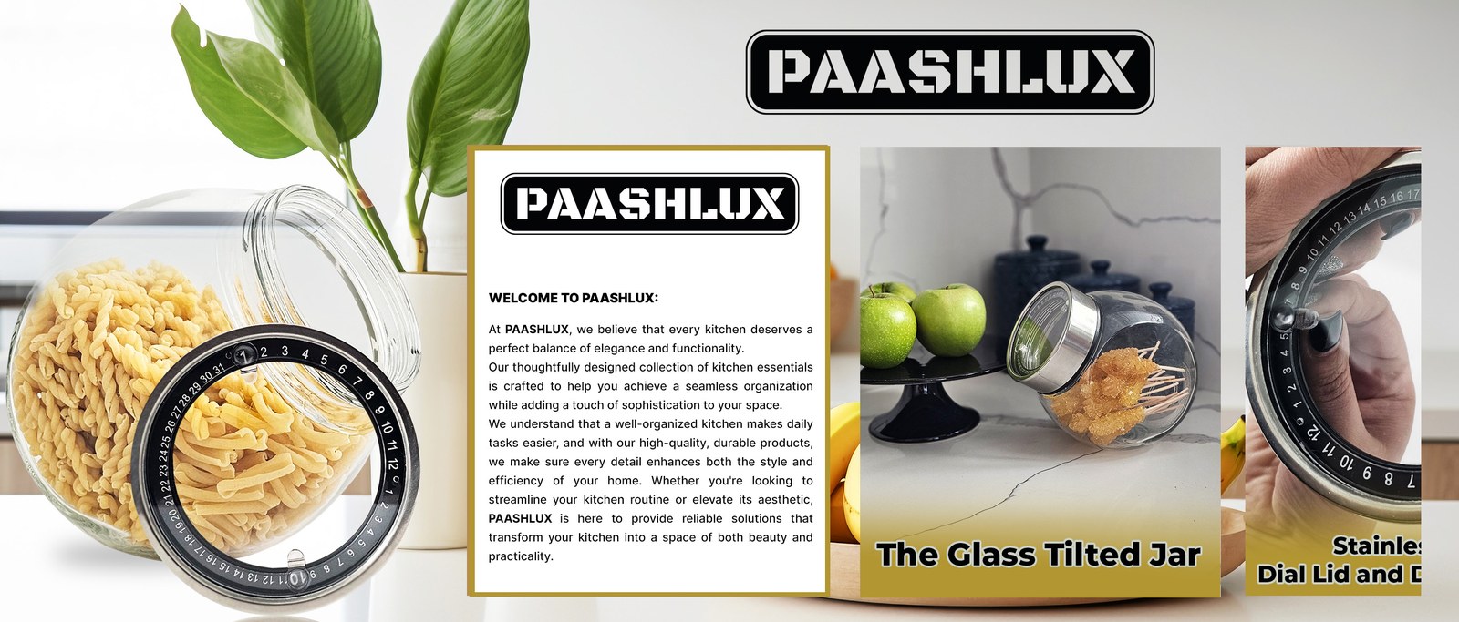
- One shared Brand Story. A welcome card and product cards over a kitchen banner, built around the Glass Tilted Jar.
- After the visuals were on the listings, A/B tests on the main image, the secondary images, and the A+ modules.
Main Images
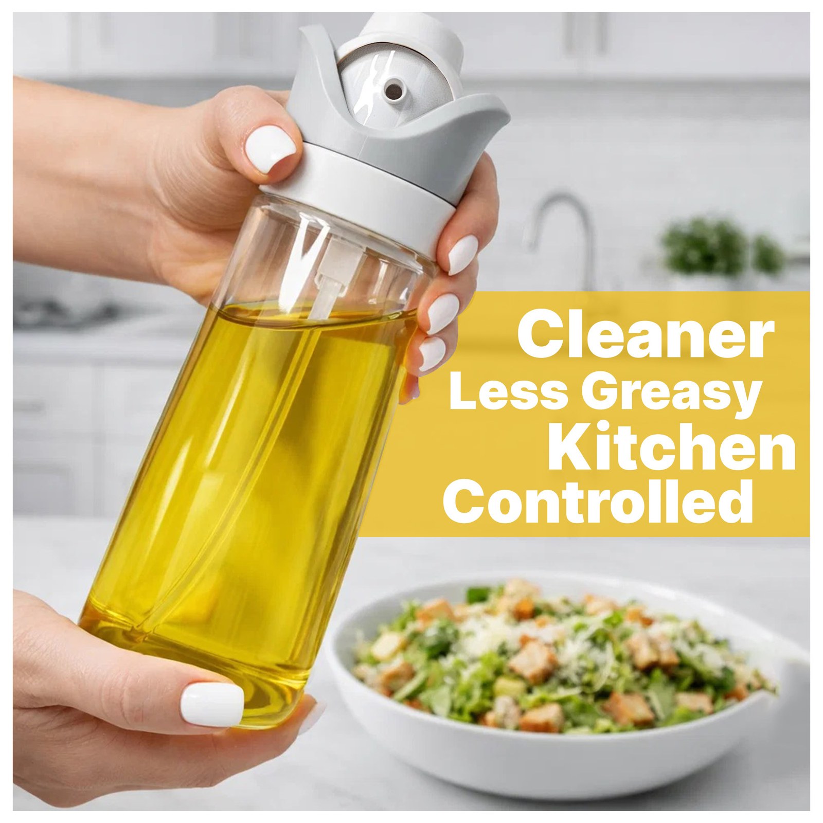
Seven square images for each product, each set built the same way: the hero stays clean so the glass reads at thumbnail size, and the frames after it answer what a shopper asks next.
Product 1: 2-in-1 Oil Dispenser & Sprayer (2-Pack)
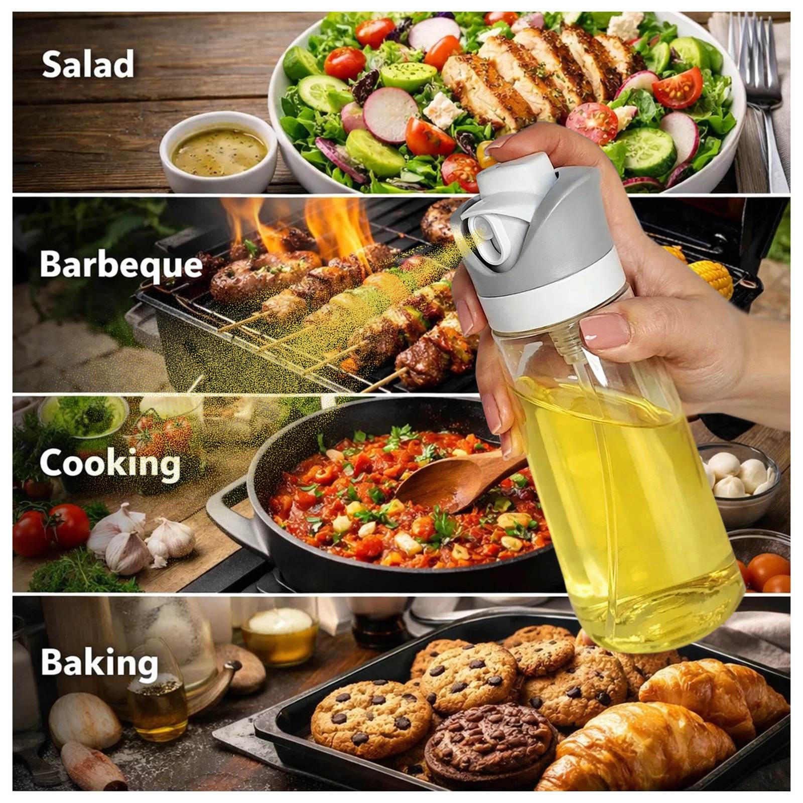
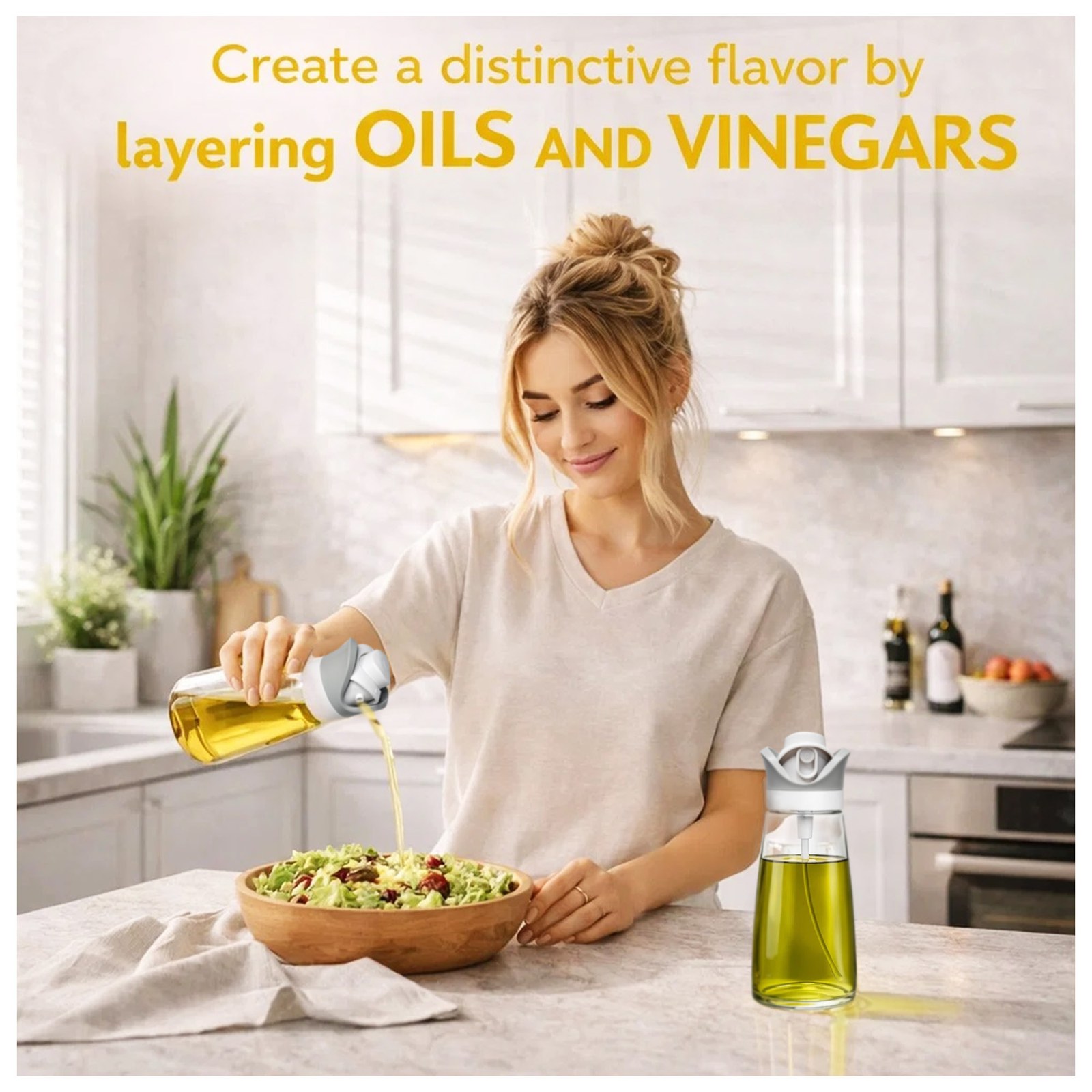
Product 2: Glass Tilted Jar with Dial Lid
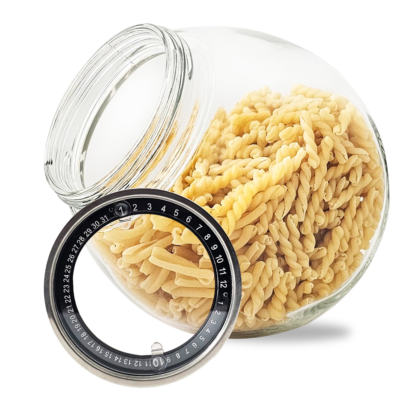
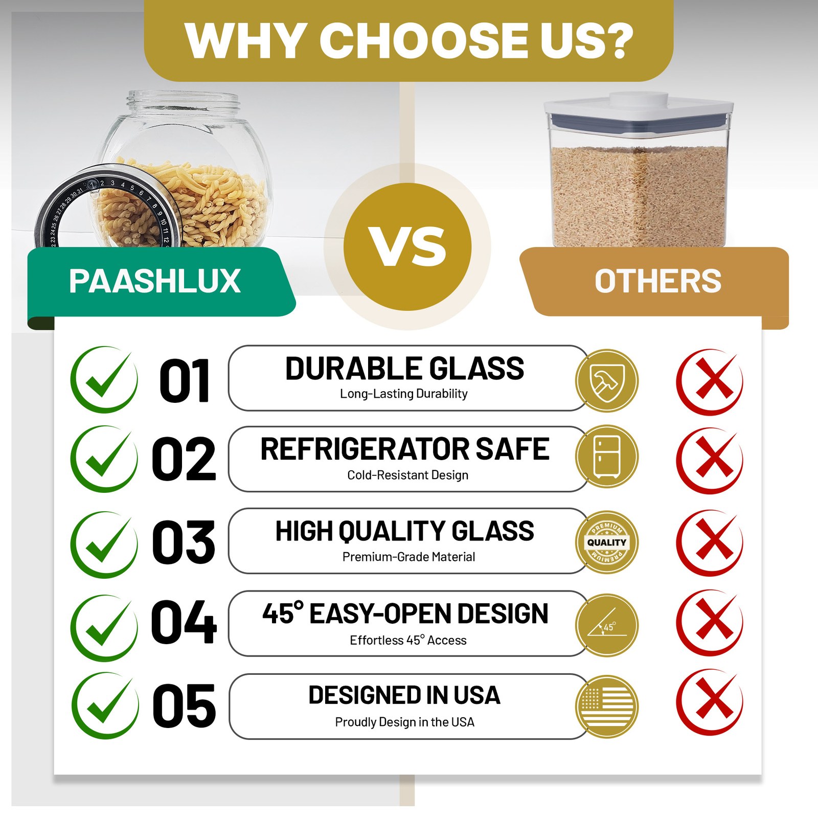
A+ Content
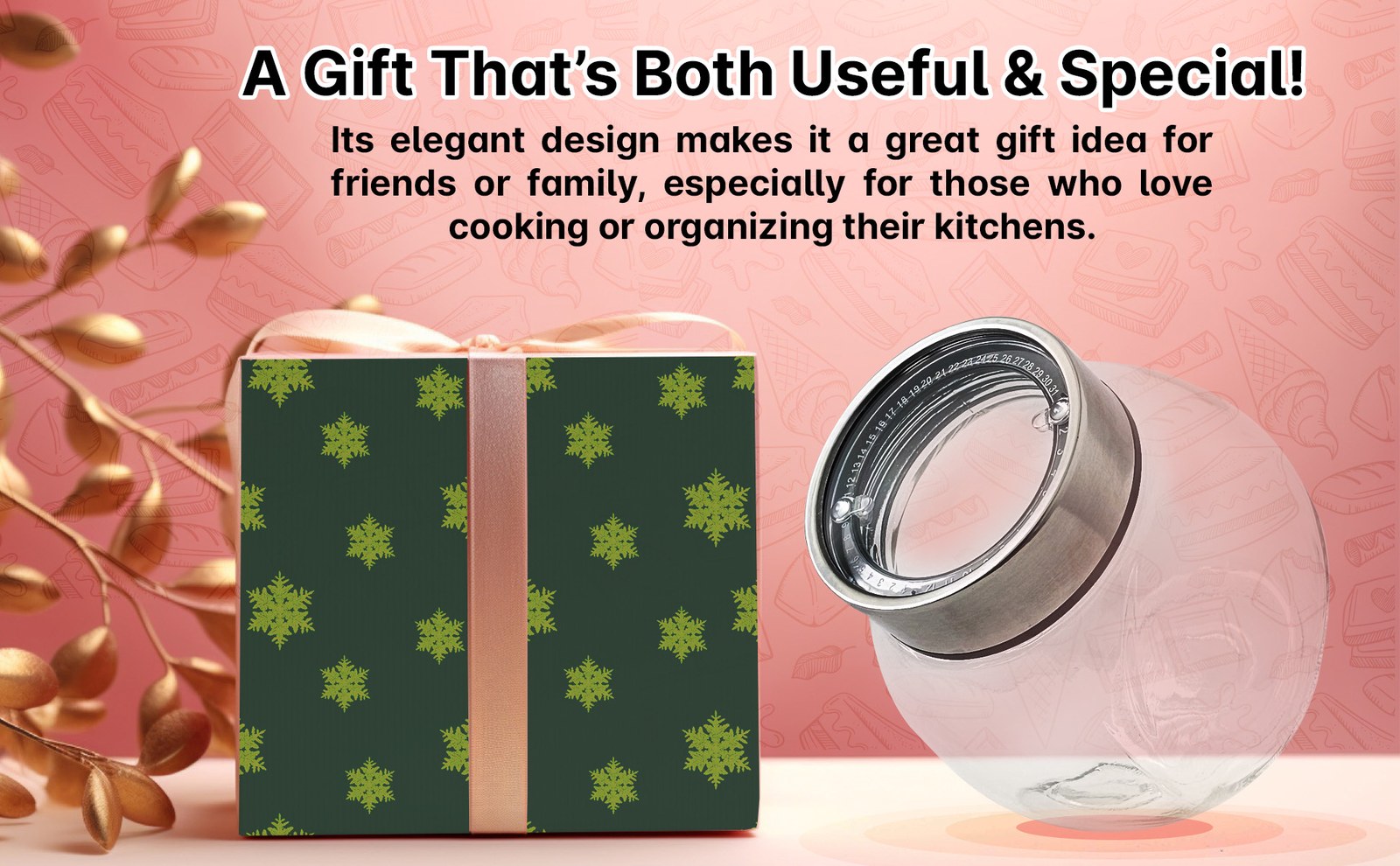
Wide modules under each listing. Both open with the PAASHLUX logo bar, then move from a hero to the main feature and on to everyday use and gifting.
Product 1: 2-in-1 Oil Dispenser & Sprayer (2-Pack)


Product 2: Glass Tilted Jar with Dial Lid

Brand Story
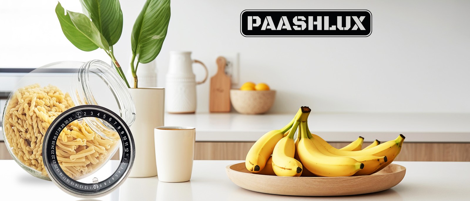
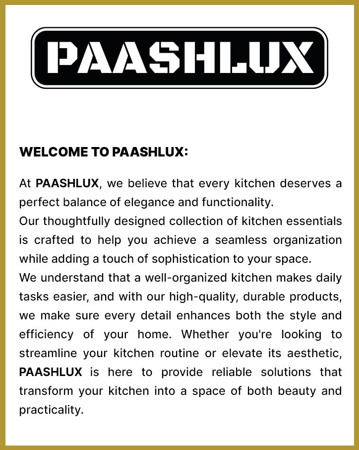
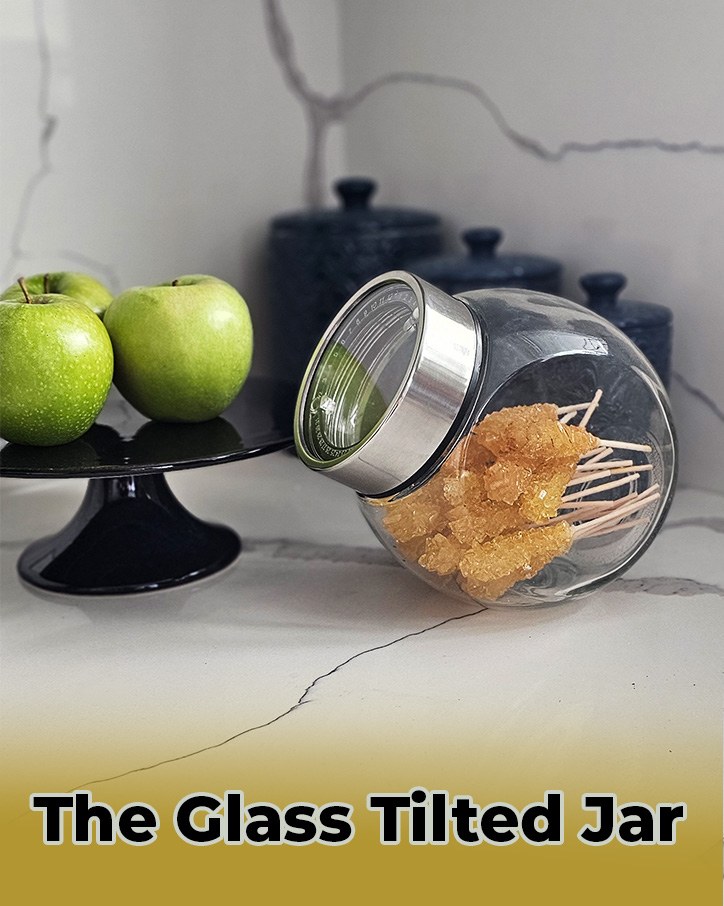
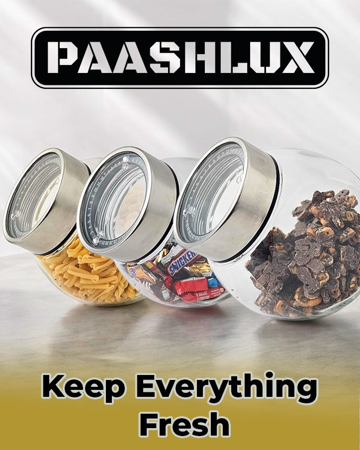
The Brand Story is shared by both products: a welcome card with the PAASHLUX introduction and four cards over a kitchen banner. This version of the story features the Glass Tilted Jar.
Cards
A/B Testing
After the visuals were designed, they were A/B tested with Amazon’s listing experiments. Each test compared one visual treatment with another on the same part of a listing: the main image, the secondary images, and the A+ modules.
The tests were there to learn which treatment shoppers responded to. This page does not report a winner or a metric. Those stay in the experiment history.