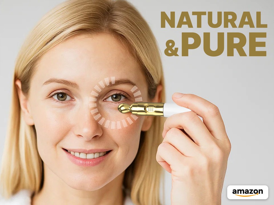
A full visual system for Bio Beauties’ Amazon listing: the main image set, A+ Content, and Brand Story for a retinol eye cream with a built-in gold vibrating applicator. The same visuals were then A/B tested on the listing.
Overview
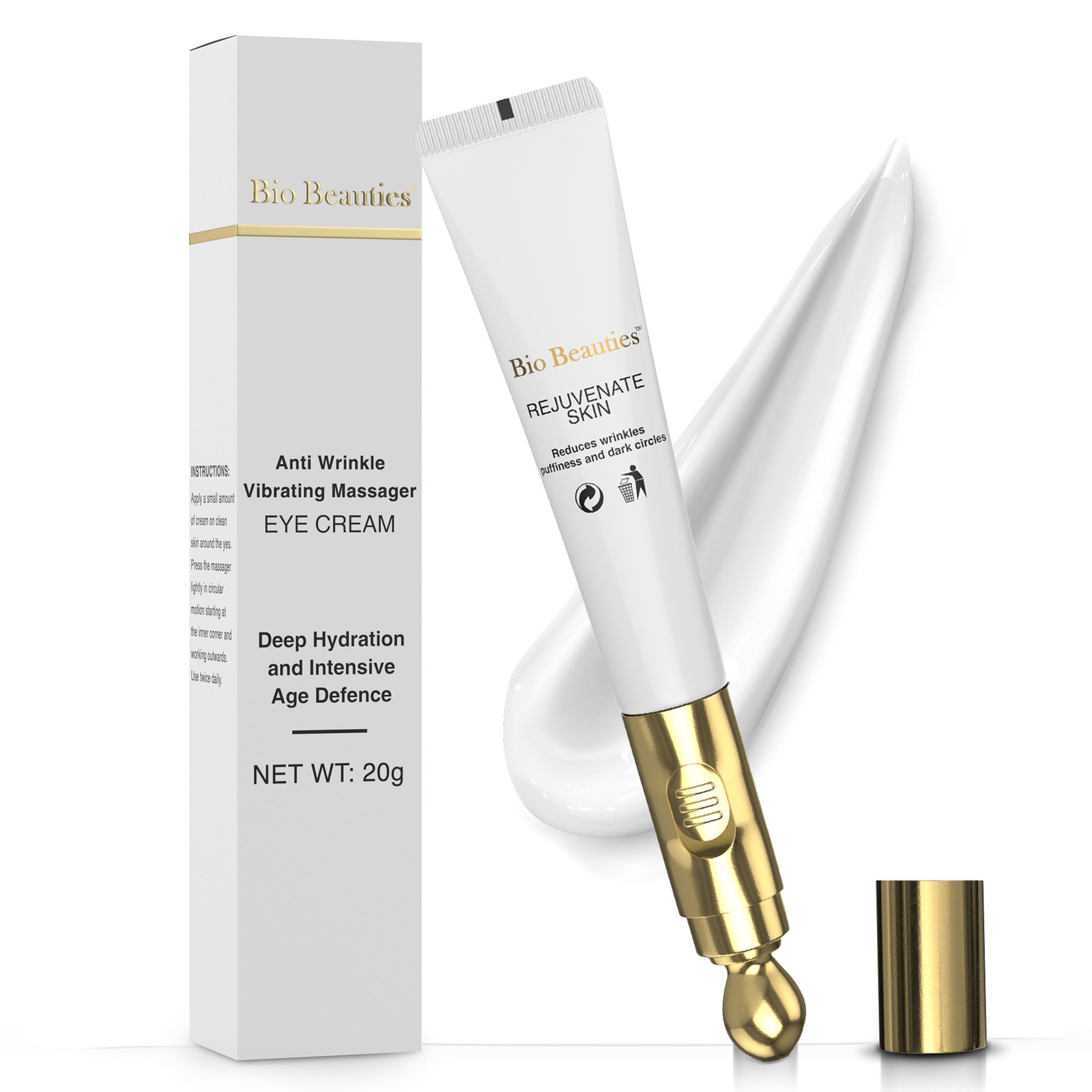
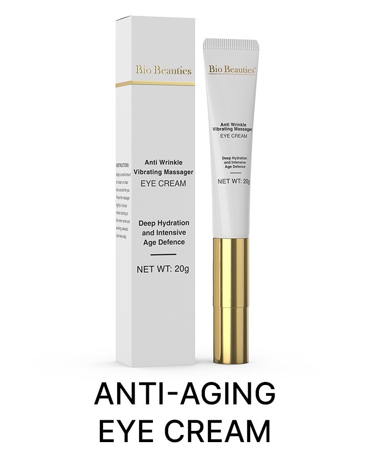
Bio Beauties is a skincare brand built on the idea that nature is the key to radiant, healthy skin. This project is its Anti-Wrinkle Vibrating Massager Eye Cream: a 20 g white tube with a gold vibrating tip, sold with a slim white box.
On Amazon the product is listed as a retinol eye cream for dark circles and puffiness with a vibrating applicator, a firming under-eye treatment for fine lines.
My Role
I designed the visual parts of the Amazon listing, then ran A/B tests on those visuals.
The design covers three listing surfaces: the main image gallery, A+ Content below the buy box, and the Brand Story. The tests compared alternate treatments of the main image, the secondary images, and the A+ modules.
Challenge
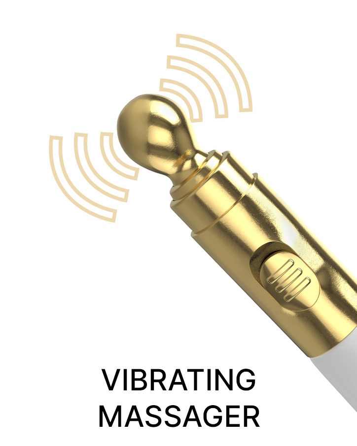
An eye cream is small and white, and in a thumbnail most tubes look the same. The images had to make one difference obvious fast: this tube has a gold vibrating applicator built in. They also had to say what it is for (puffiness, dark circles, fine lines) without crowding a small product.
The A+ modules and Brand Story then had to feel like skincare, not hardware: soft light, real faces, a gold-and-cream palette, and clear steps for how to use it.
Process
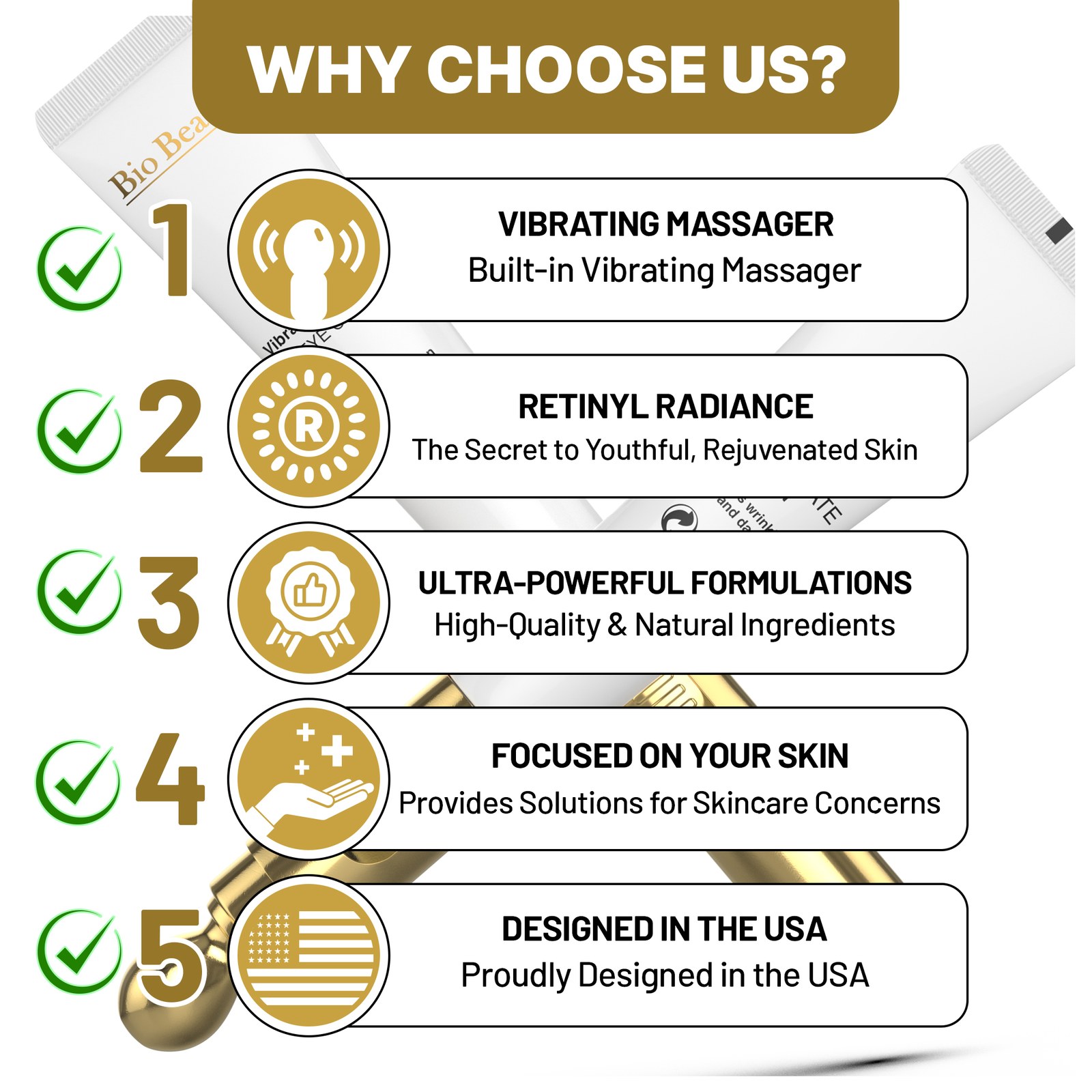
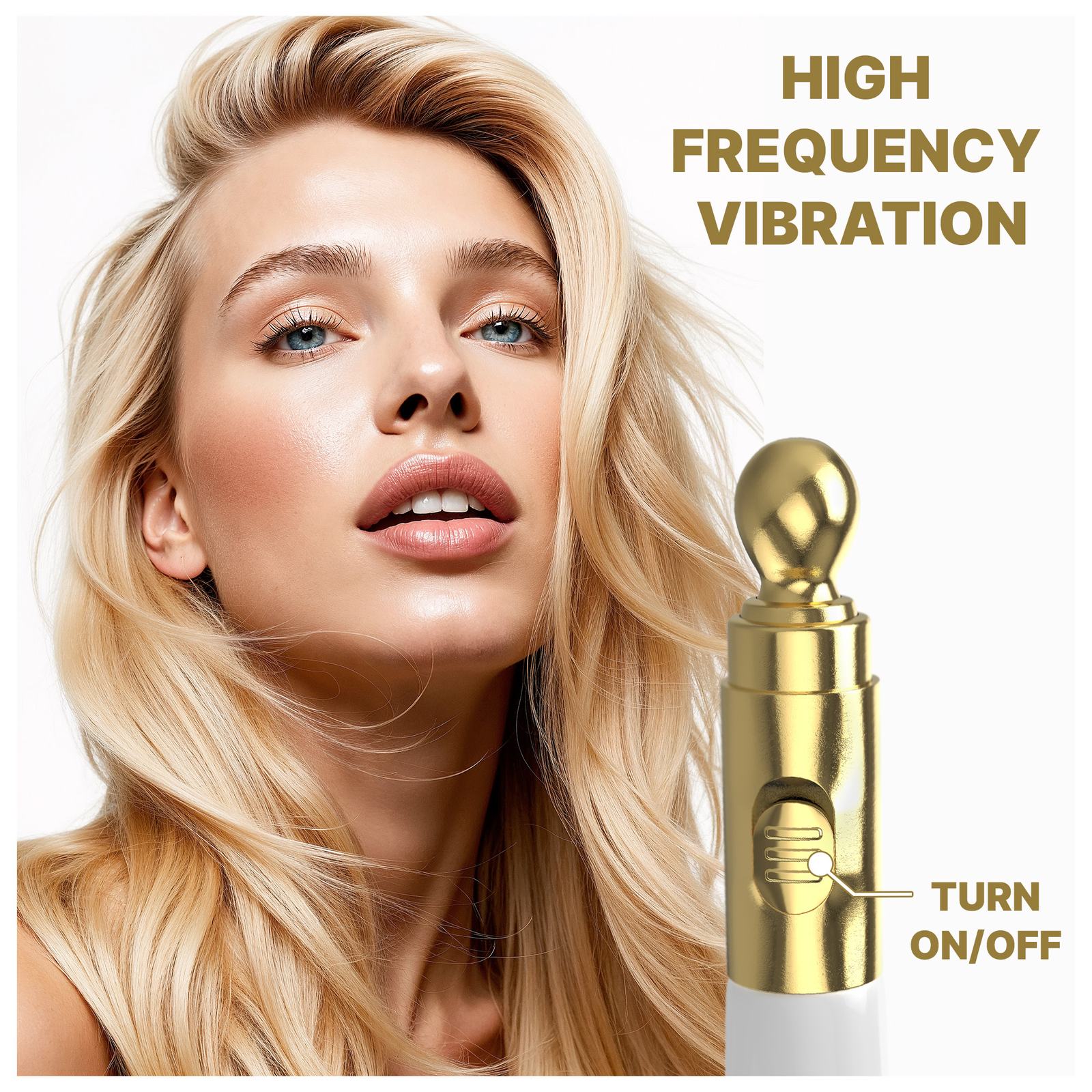
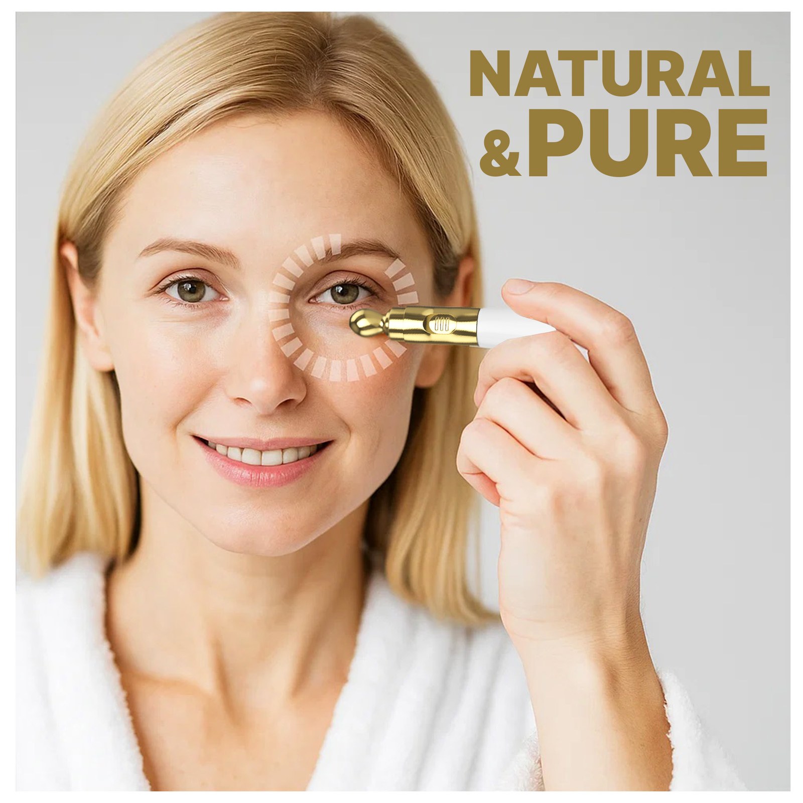
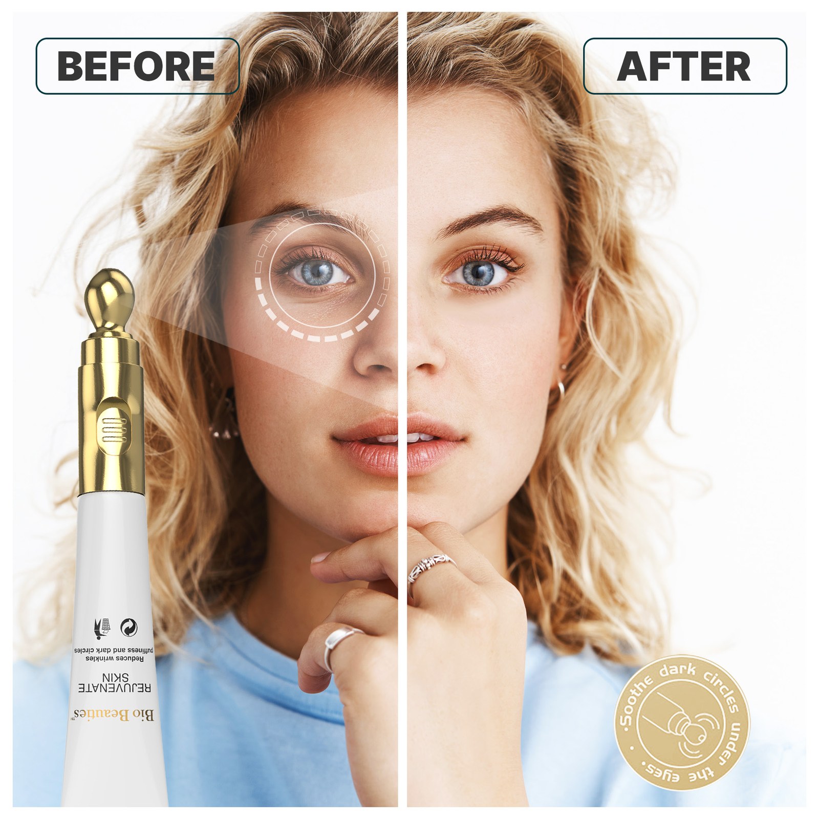
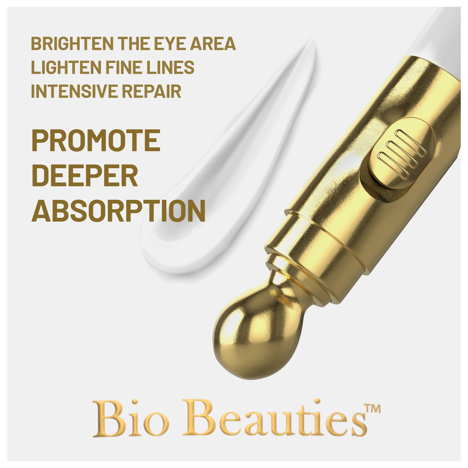
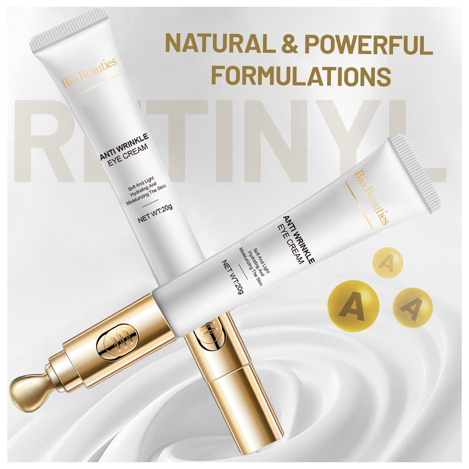
- Main images first. A clean white hero of the box, tube, and gold tip, then square images for the five reasons to choose it, the vibration feature, the applicator in use, a before-and-after portrait, deeper absorption, and the retinyl formulation.
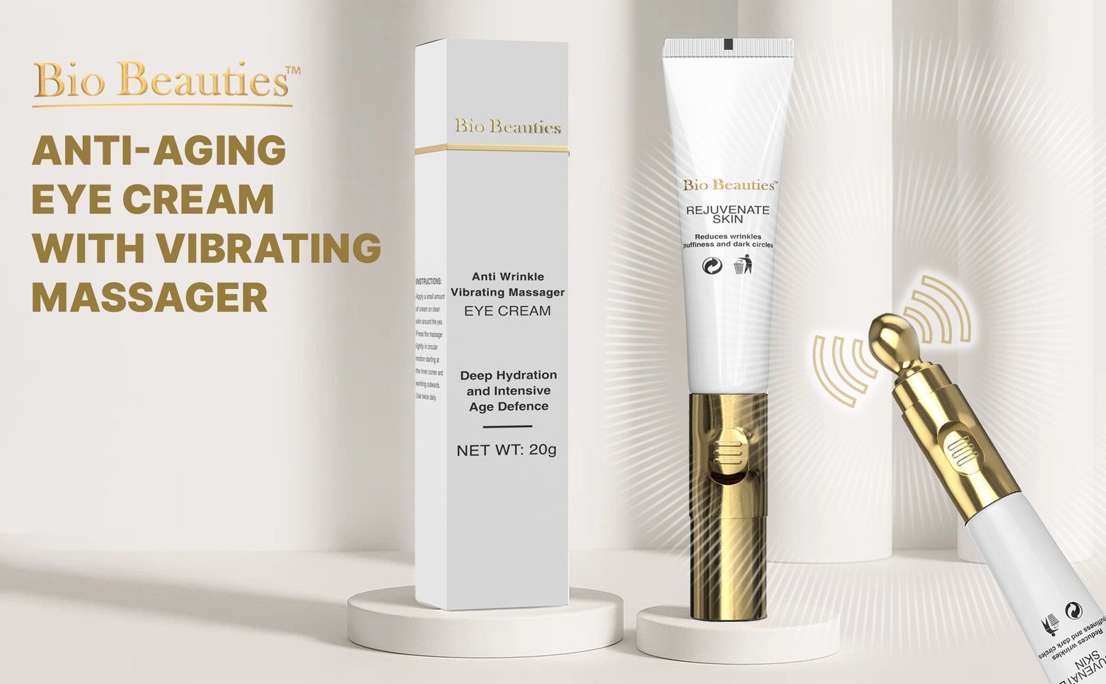
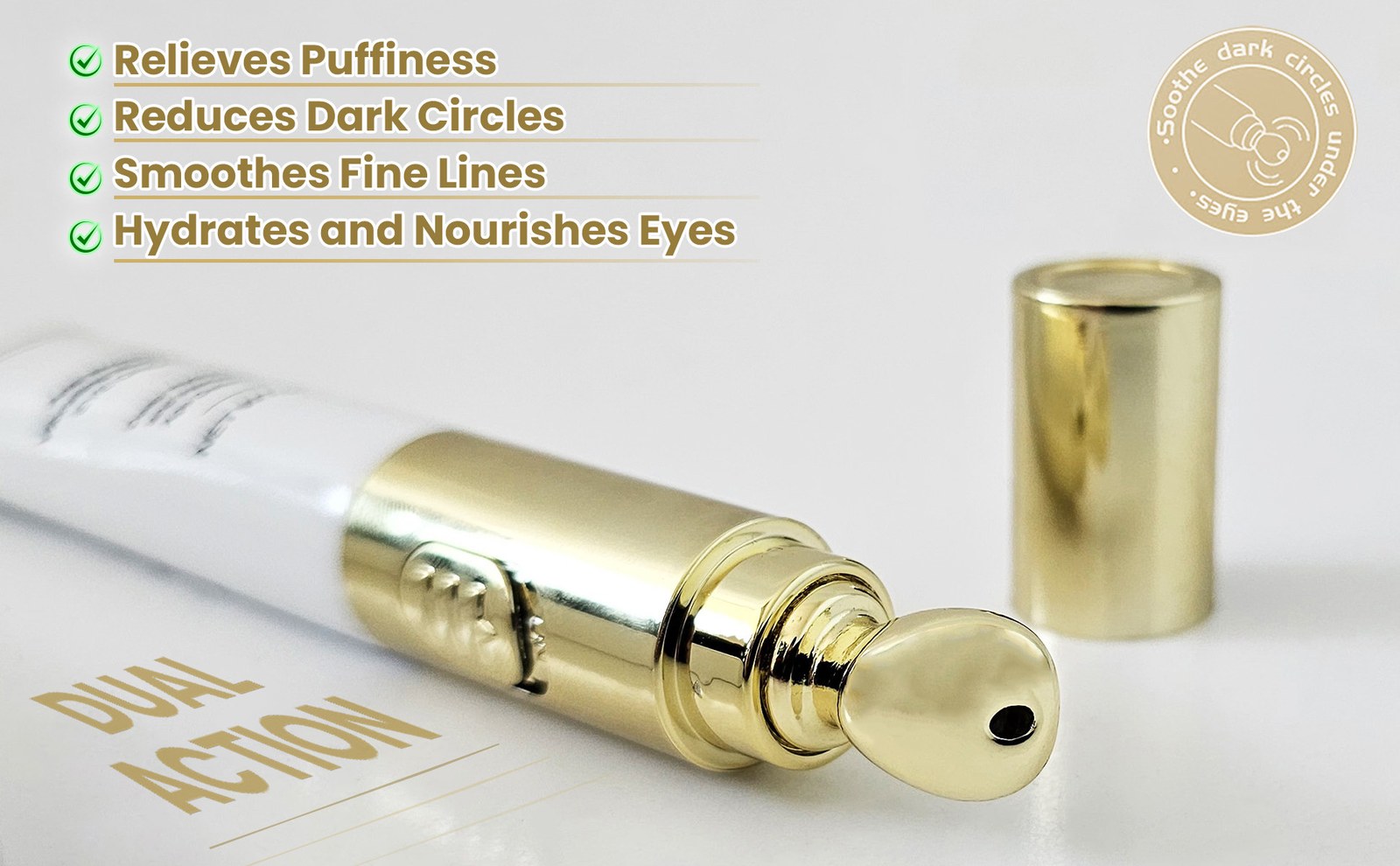
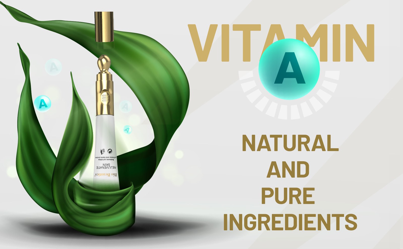
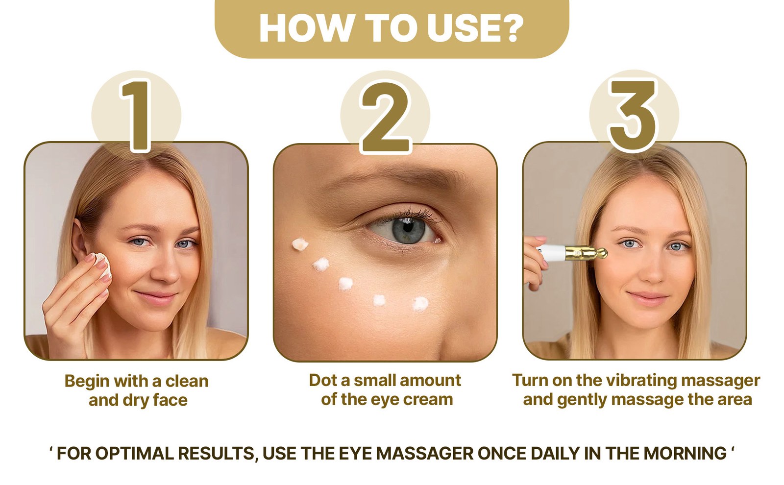
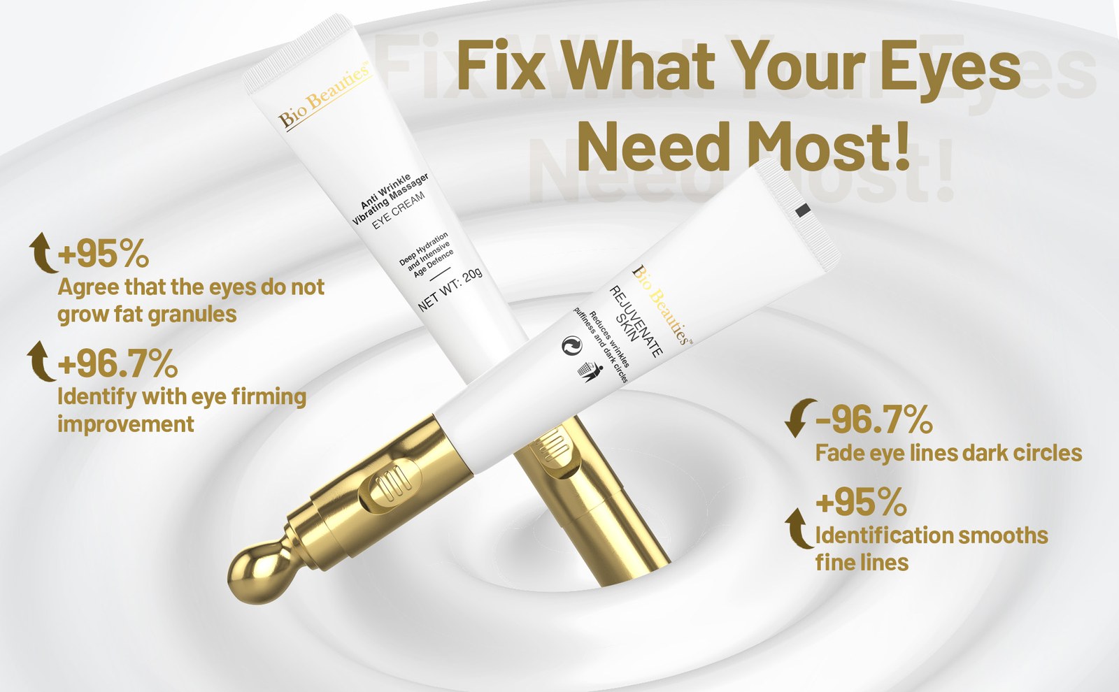
- A+ Content next. A logo bar, then wide modules for the hero, the dual action of the tip, vitamin A ingredients, a three-step how-to, and a closing benefits panel.
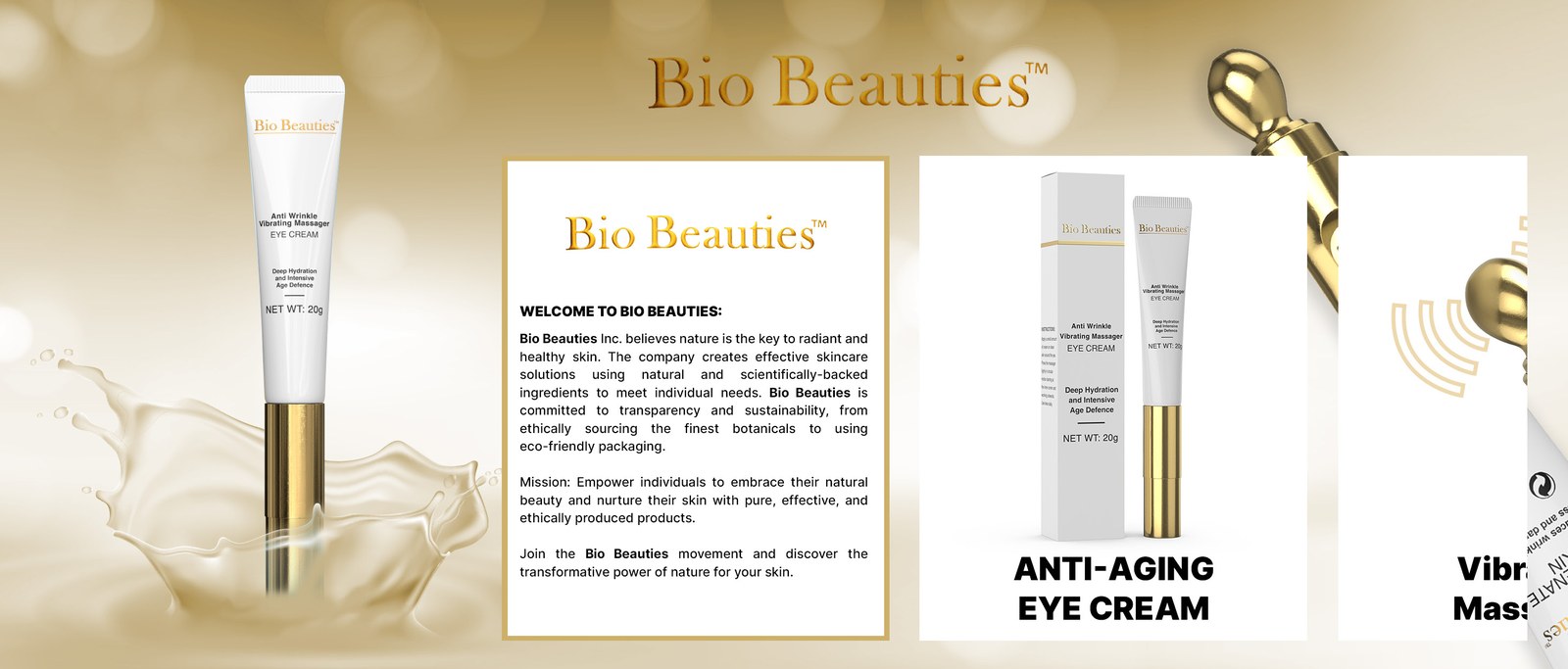
- Brand Story last. A soft gold brand field with the tube and gold tip, a welcome card in the brand’s own words, and product and portrait cards.
- After the visuals were on the listing, A/B tests on the main image, the secondary images, and the A+ modules.
Main Images
Seven square listing images. The hero stays on white so the tube and gold tip read at thumbnail size. The frames after it cover why to choose it, how it vibrates, how it looks in use, and what is in the formula.
A+ Content
Wide modules under the listing. The logo bar leads, then a studio hero, the dual-action close-up, vitamin A, how to use, and a closing benefits panel.

Brand Story
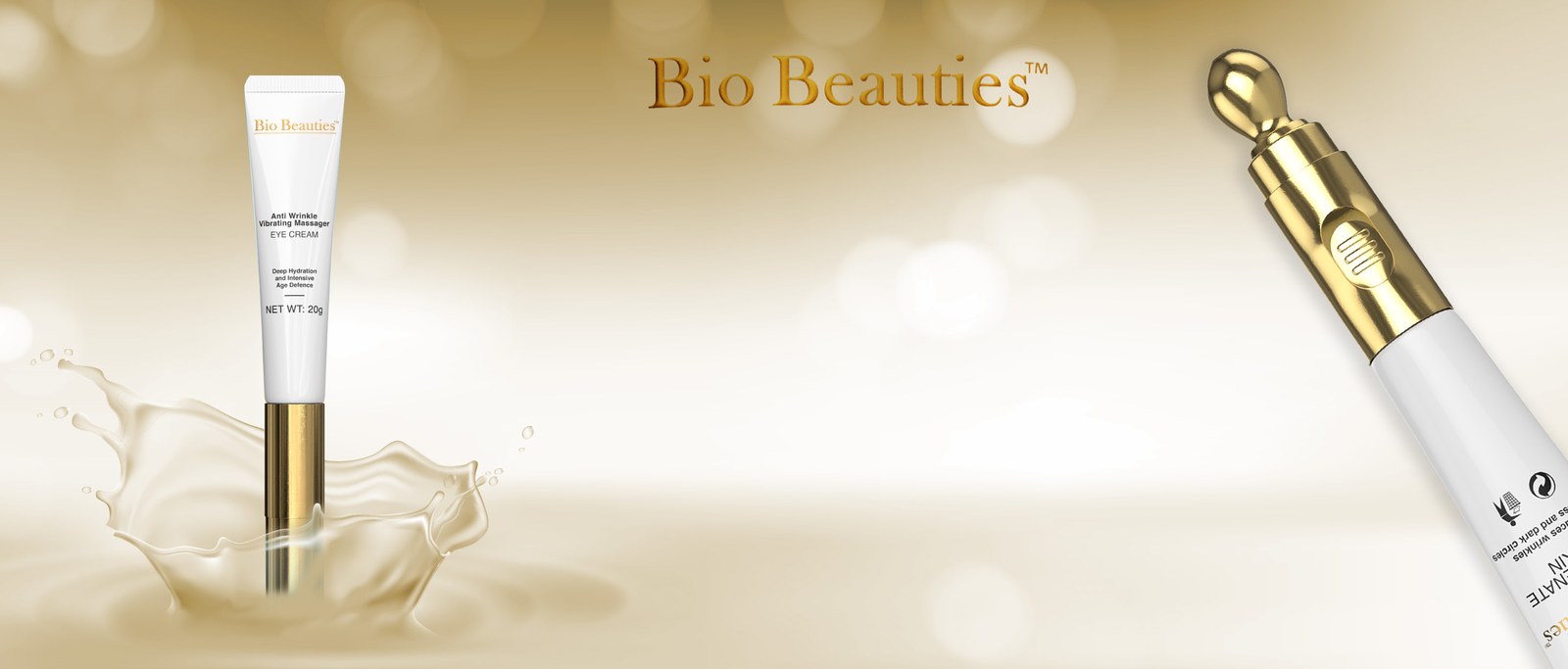
Amazon Brand Story uses a wide brand image and a row of cards. The field is a warm gold-and-cream backdrop with the tube, a splash of cream, and the gold tip. The welcome card is set in Bio Beauties’ own words.
Cards

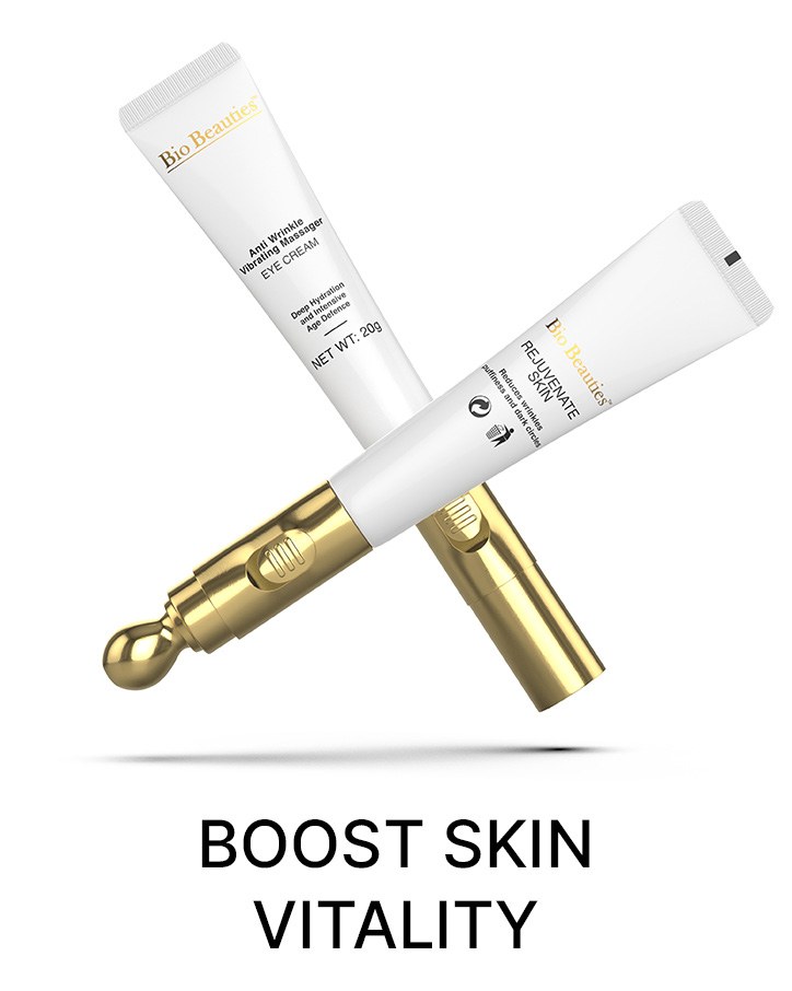
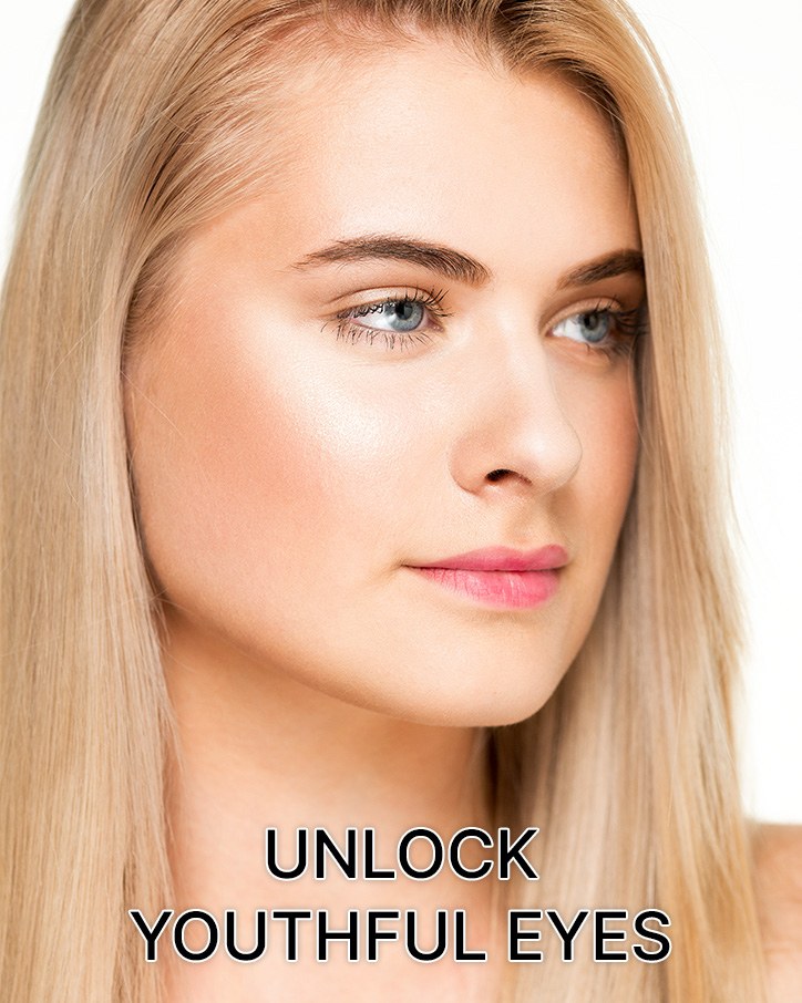
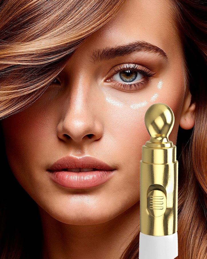
A/B Testing
After the visuals were designed, they were A/B tested with Amazon’s listing experiments. Each test compared one visual treatment with another on the same part of the listing: the main image, the secondary images, and the A+ modules.
The tests were there to learn which treatment shoppers responded to. This page does not report a winner or a metric. Those stay in the experiment history.