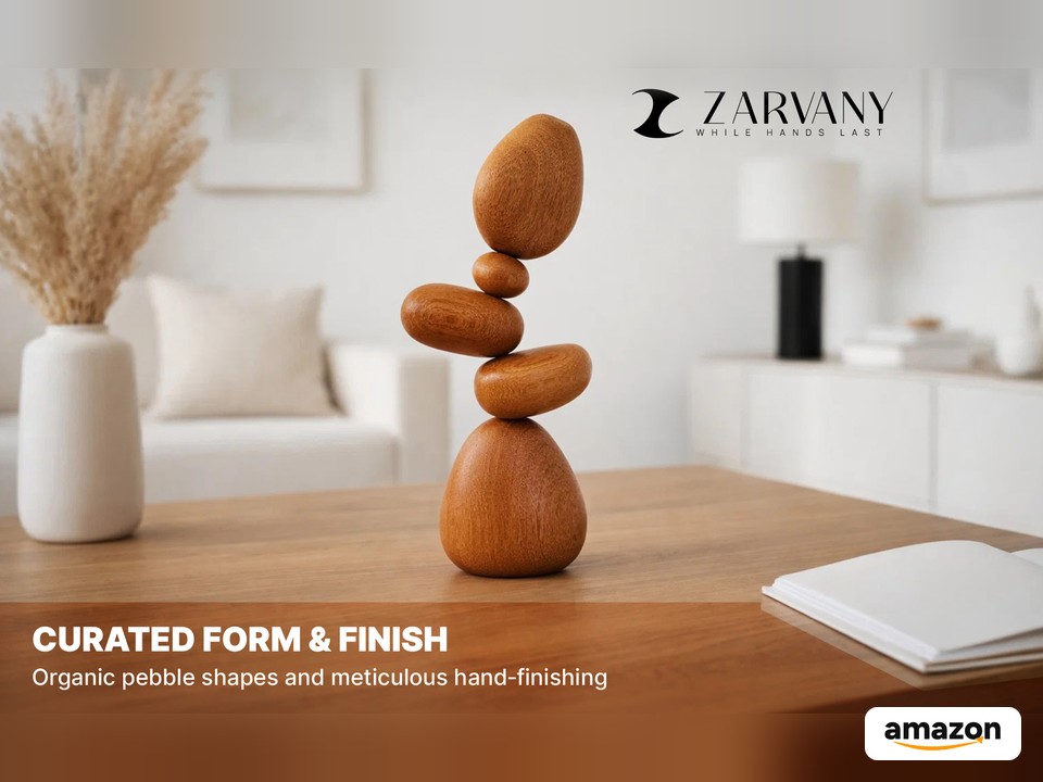
A full visual system for ZARVANY’s Amazon listing: the main image set, A+ Content, and Brand Story for a five-stone magnetic wood cairn. The same visuals were then A/B tested on the listing.
Overview
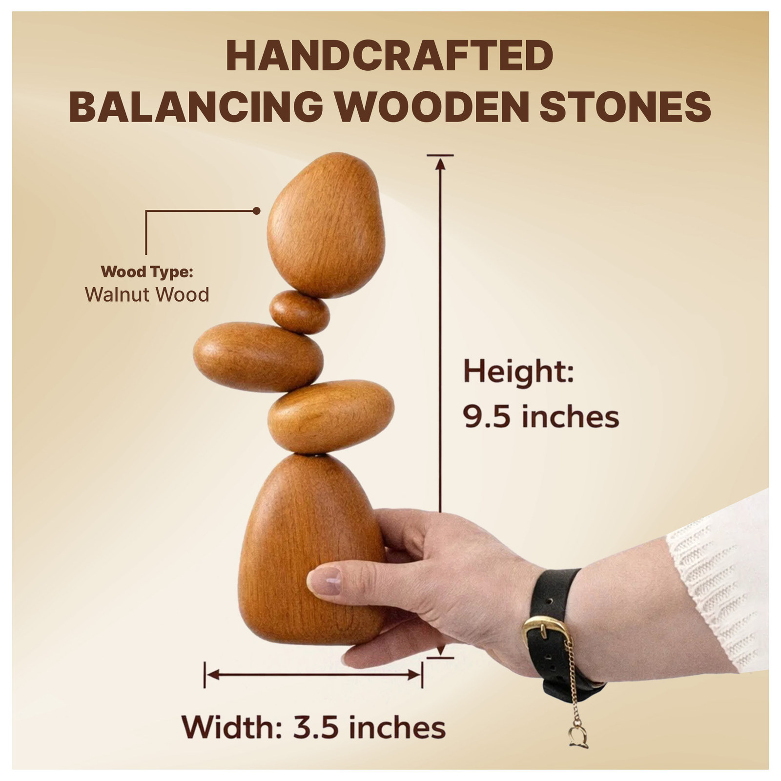
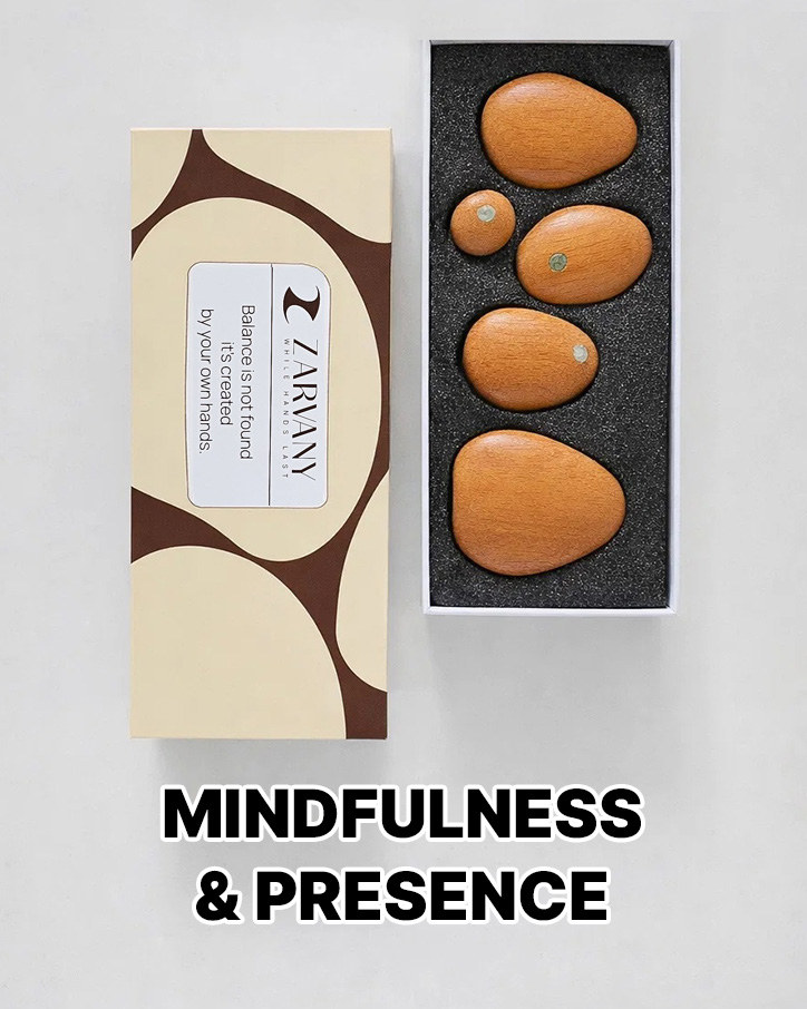
ZARVANY sits between art, philosophy, and interior design under the line “While Hands Last.” This project is the Cairn Sculpture: five hand-polished wooden stones, each with an embedded magnet, that stack into a 9.5-inch tall, 3.5-inch wide piece for a desk, shelf, or meditation corner. It ships in a cream and brown gift box.
On Amazon the product is listed as the Zarvany Cairn Sculpture, Magnetic Wood Art for Desk, Office & Indoor Decor.
My Role
I designed the visual parts of the Amazon listing, then ran A/B tests on those visuals.
The design covers three listing surfaces: the main image gallery, A+ Content below the buy box, and the Brand Story. The tests compared alternate treatments of the main image, the secondary images, and the A+ modules.
Challenge
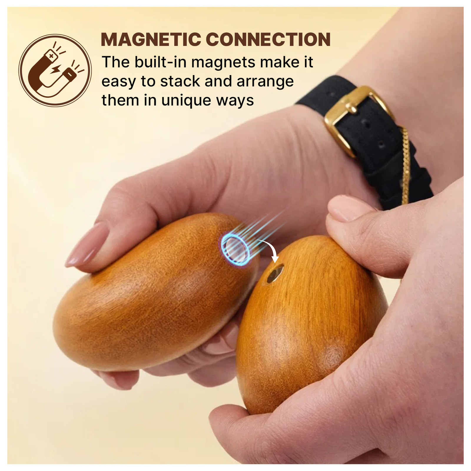
A wooden cairn is a quiet object. In a search grid it is a brown stack on a white square, and it can be mistaken for a plain wood ornament. The images had to show what makes it more than that: the magnets that let you stack and rearrange it, the hand-polished grain, the real size, and the gift box.
The listing also had to sell a feeling, not a feature list. The A+ modules and Brand Story needed calm interiors, wellness settings, and gifting scenes so the cairn reads as a considered piece of decor, with a warm walnut-brown and cream palette tying every surface together.
Process
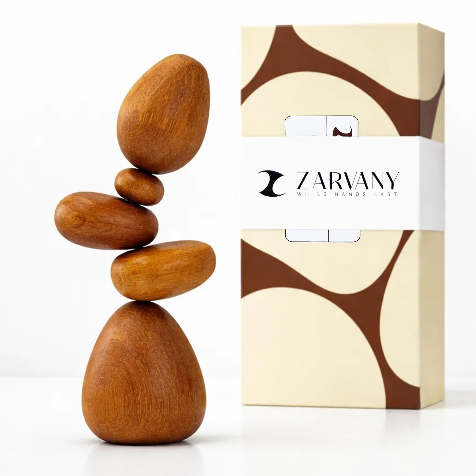
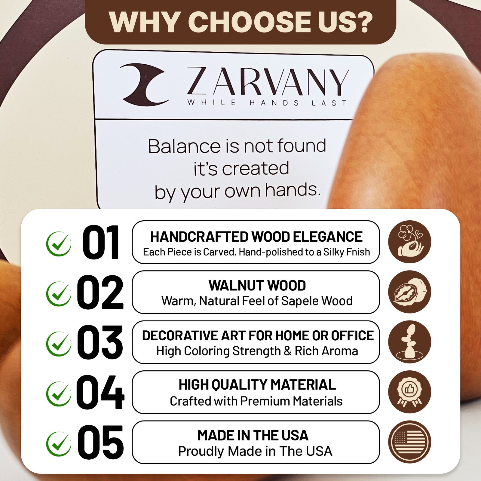
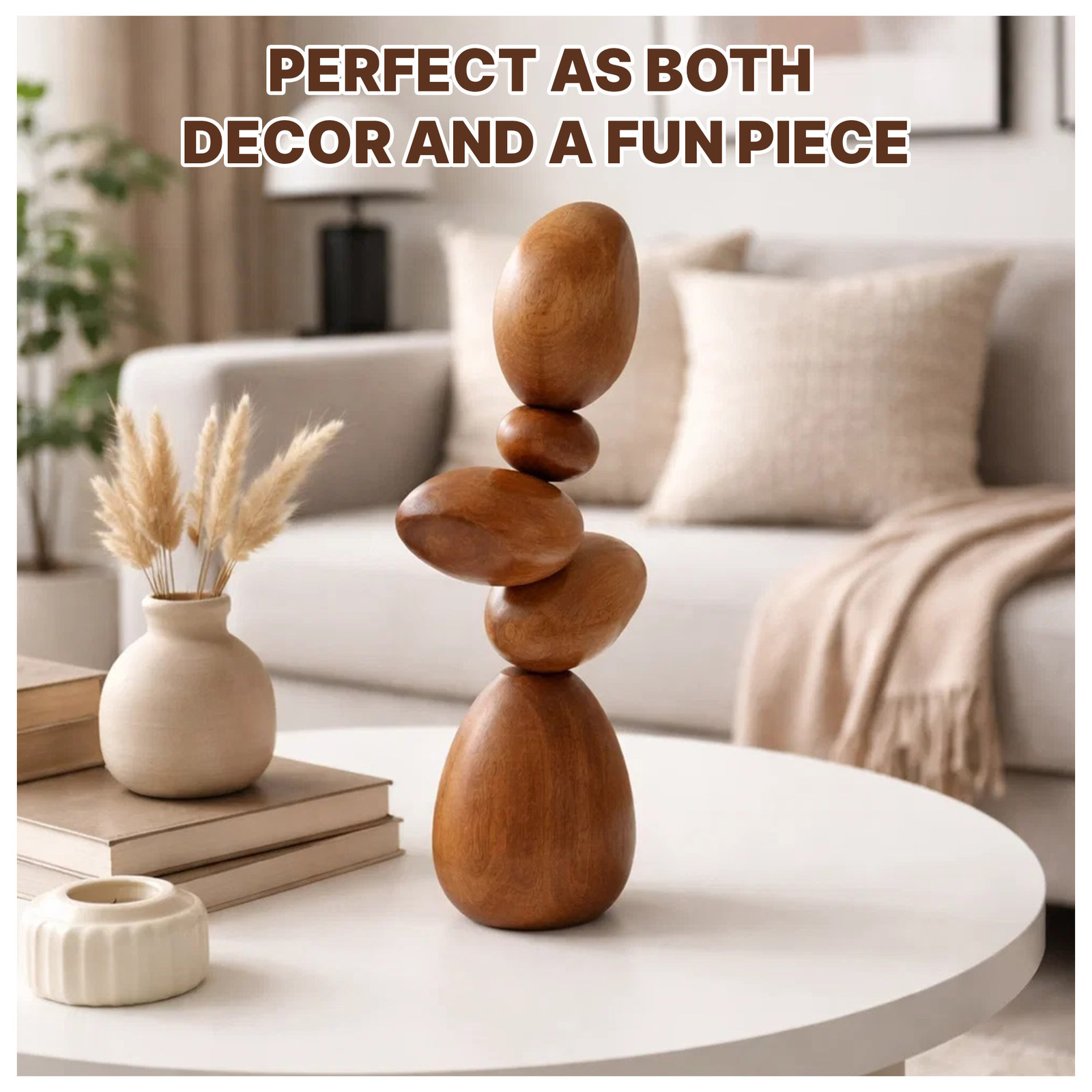
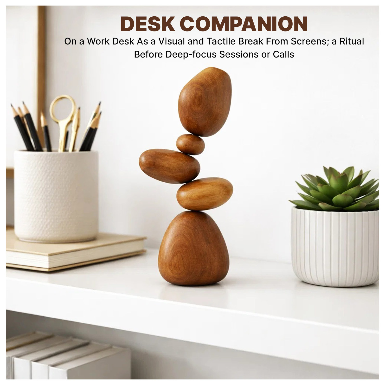
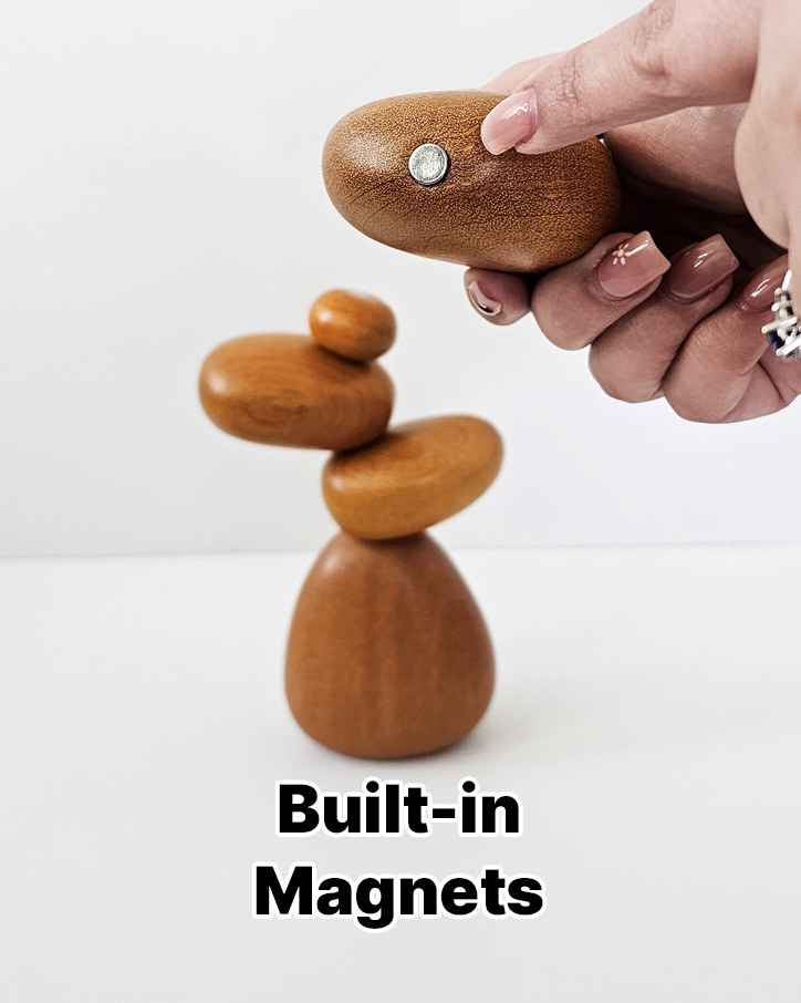
- Main images first. A clean white hero of the stack beside its box, then square images for the reasons to choose it, dimensions with a hand for scale, a living room scene, the magnetic connection, a meditation setting, and a desk setting.
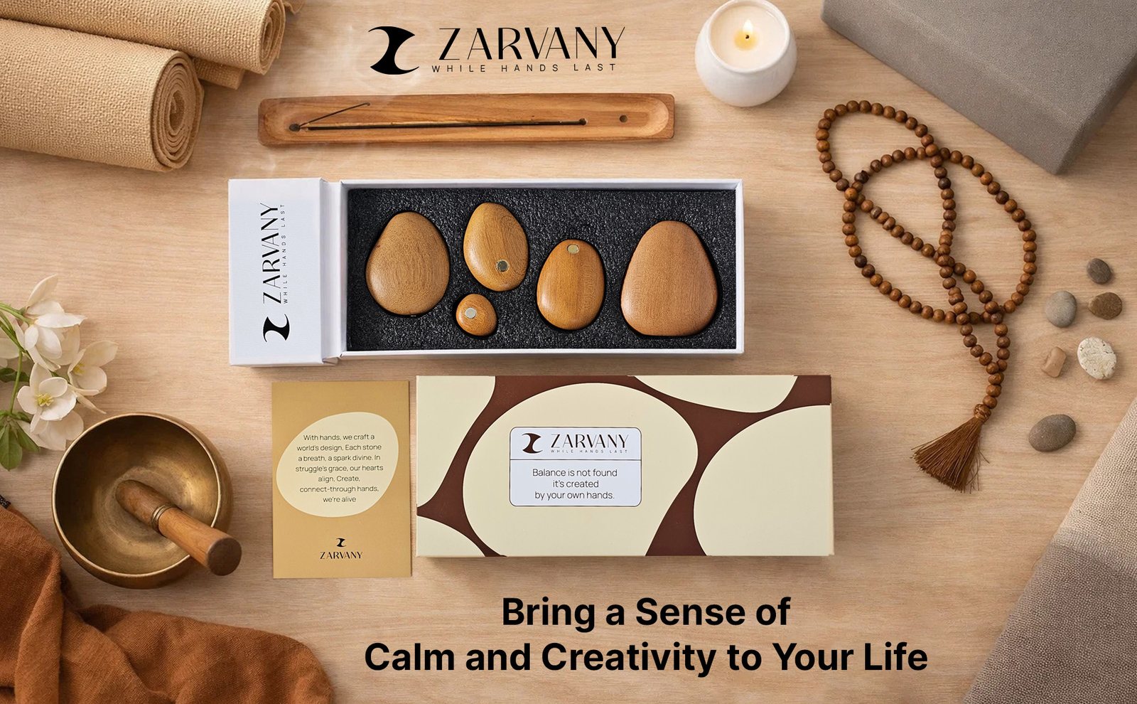
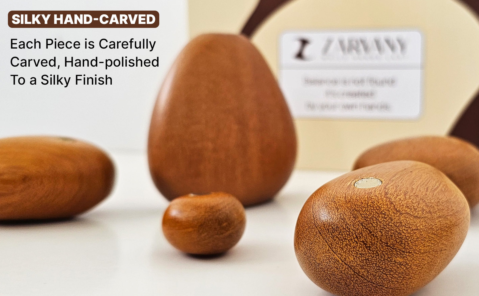
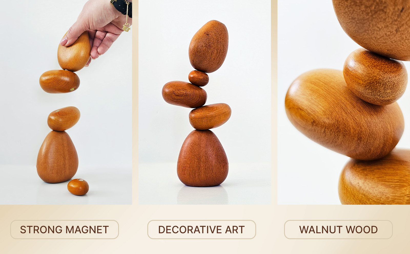
- A+ Content next. A logo bar with the brand line, then wide modules for a calm flat-lay opener, the hand-carved finish, the stack in a minimalist room, a three-panel feature strip, and gifting.
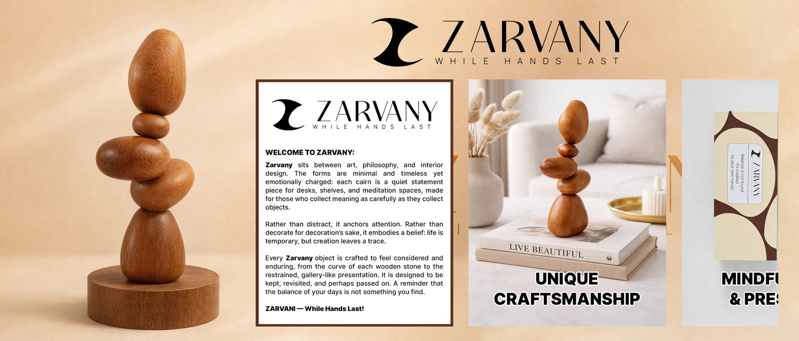
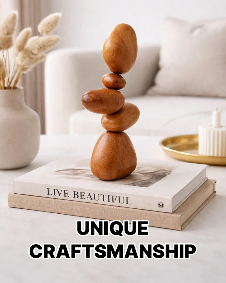
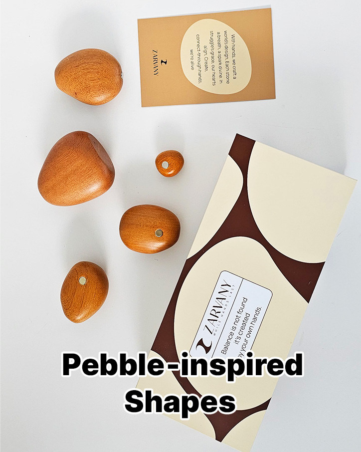
- Brand Story last. A warm brand field, a welcome card in the brand’s own words, and image cards for craftsmanship, mindfulness, shapes, and magnets.
- After the visuals were on the listing, A/B tests on the main image, the secondary images, and the A+ modules.
Main Images
Seven square listing images. The hero stays on white so the stack and box are clear at thumbnail size. The frames after it answer the questions shoppers ask about a decor piece: why this one, how big, where it goes, and how it works.

A+ Content
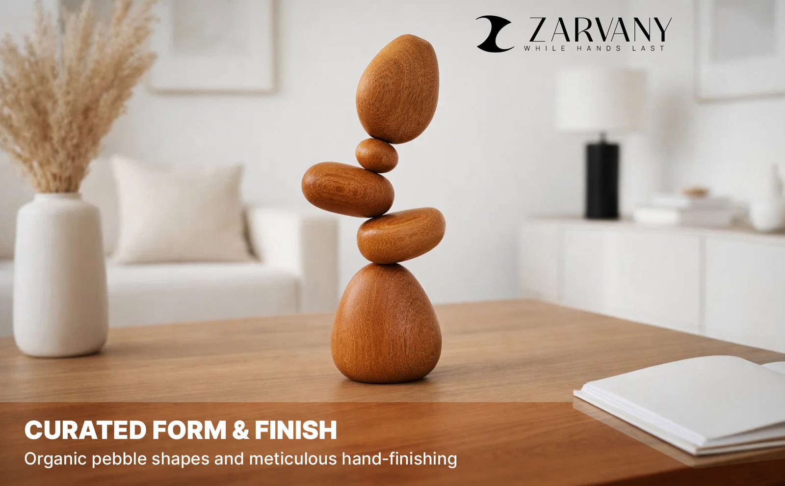
Wide modules under the listing. The logo bar leads, then a calm opener, the hand-carved finish, the stack in a room, a three-panel strip, and gifting.

Brand Story
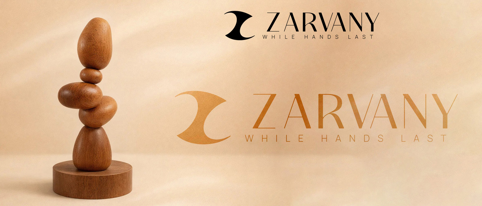
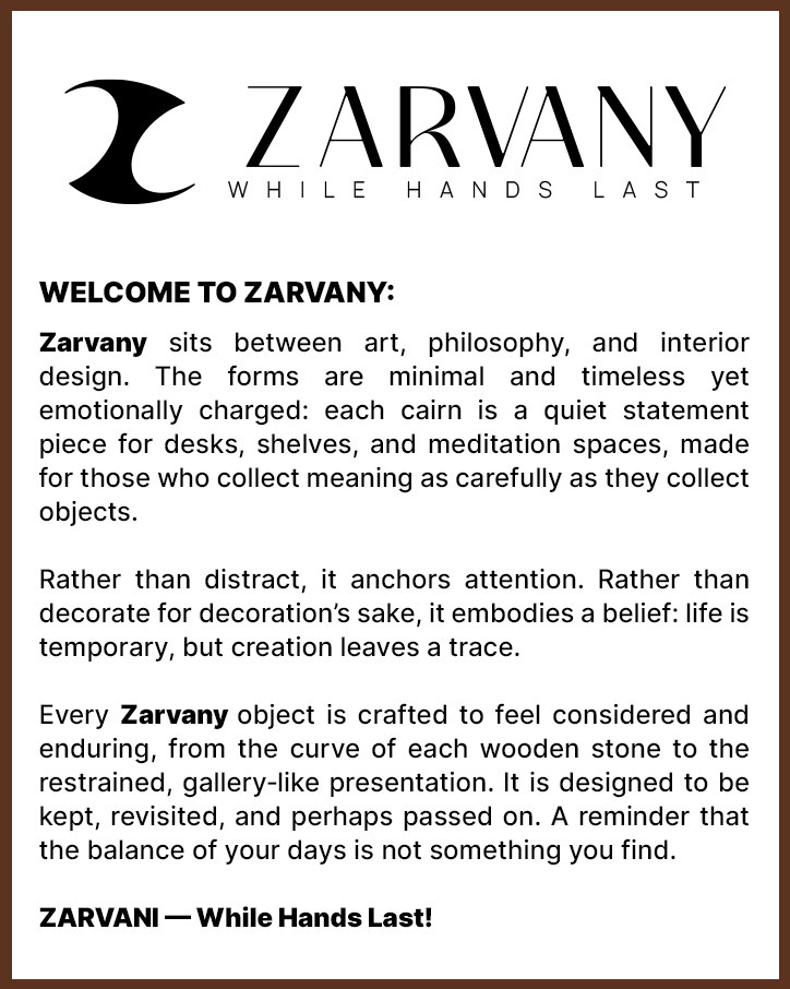
Amazon Brand Story uses a wide brand image and a row of cards. The field is a warm peach backdrop with the stack and the ZARVANY wordmark. The welcome card is set in ZARVANY’s own words.
Cards
A/B Testing
After the visuals were designed, they were A/B tested with Amazon’s listing experiments. Each test compared one visual treatment with another on the same part of the listing: the main image, the secondary images, and the A+ modules.
The tests were there to learn which treatment shoppers responded to. This page does not report a winner or a metric. Those stay in the experiment history.